2025
B2C
Mobile App
Item Finder App
Designed an item locator app to help users easily find misplaced household items.
My Role
Product designer
Timeline
3 Months
Team
Only me
Context
Overview
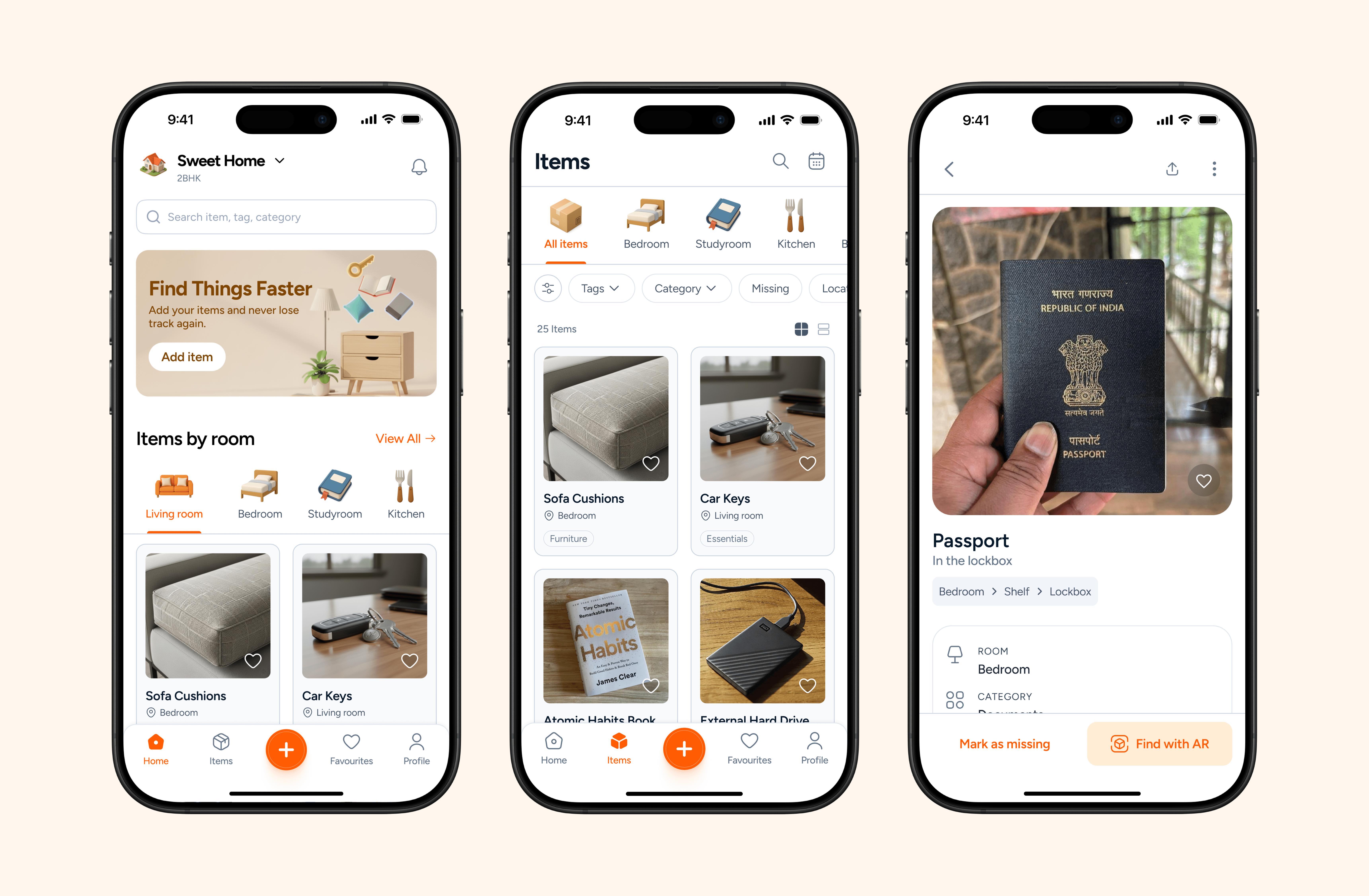
Item Finder is a simple app to help them find things at easily, The app lets users add items with a name, photo, and location.
I designed this app from the scratch , starting with user research, mapping the emotional pain of “where did I keep it?” moments in homes , to creating clear, scalable flows that simplify how items are added, searched, and managed.
The Everyday Problem
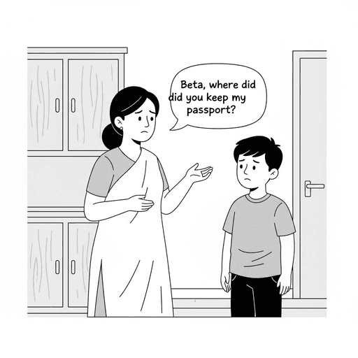
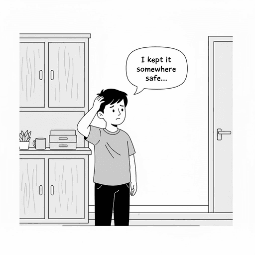
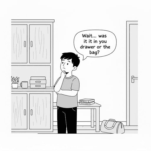
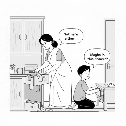
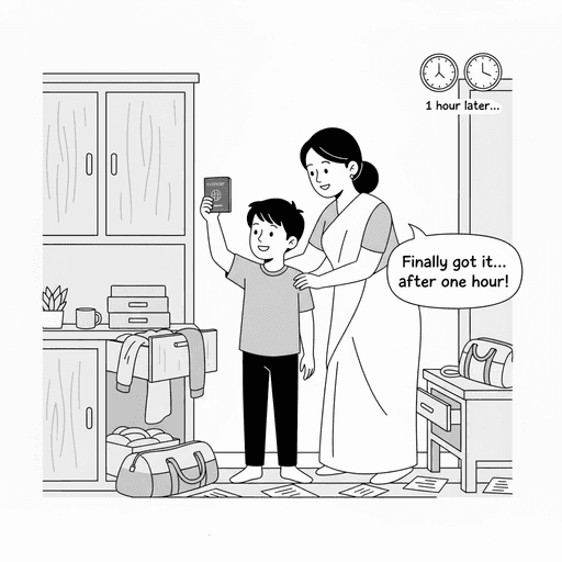
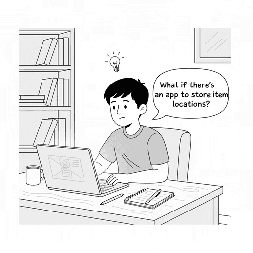
But , Why do people forget where they placed items?

Larger Homes Create Complexity
In multi-room homes , items get scattered across rooms and storage boxes.
Multiple users moving things adds confusion, especially for rarely used seasonal items.

Limited Working Memory
The human brain can only track 4–7 things in short-term memory.
When multitasking, we often fail to encode the item’s location properly.
No Consistent Storage Pattern
People place items wherever convenient at the moment.
Without a fixed system or routine, recall becomes unreliable later.

Out of Sight, Out of Mind
Once hidden in drawers or boxes, items lose visual cues the brain deprioritizes them.
Retrieval then depends entirely on weak memory recall.

Environmental Changes
Family members or cleaners often move items without notice.
Rearranging spaces resets previously formed spatial memory.

Cognitive Overload & Stress
Managing work, family, and personal tasks leads to mental fatigue.
The mental clutter makes it harder to notice small details

Problem
People frequently forget where they have placed physical items in their homes leading to time wastage, frustration, and clutter accumulation.
Traditional methods like labeling boxes or relying on memory are inefficient, especially when managing many small or infrequently used items. There is no intuitive system that helps people visually mark and locate their belongings using their phone in the physical space around them.
Why is this a problem worth solving?
Time Waste
Searching for misplaced items wastes minutes daily, adding up to hours per month.
Impacts productivity during urgent tasks (e.g., looking for a passport before travel

Stress & Frustration:
Not finding items when needed creates avoidable stress and mental frustration.
Contributes to negative emotional states in daily life.

Financial Impact
Leads to purchasing duplicates unnecessarily (tools, chargers, stationery).
Adds to clutter, requiring more time and money for decluttering or storage.
Impact on Family/Teams
Family members or coworkers may argue or feel blamed for “misplacing” shared items.
Shared spaces become disorganized, reducing harmony.

Existing Solutions Are Inadequate
Labeling, spreadsheets, or traditional inventory apps do not link digital records to the physical location visually.
Users struggle to maintain and reference these systems consistently.
Design process
Who I’m solving this problem ?
To begin solving the problem, I thought deeply about who the users might be. Although this problem can affect almost everyone, I analyzed and identified key groups such as family members (especially elderly or seniors), professionals, students, and more.
Design Challenge
How can I help people find their items quickly and easily without relying on memory?
Competitor Analysis
Once I understood what problems needed to be solved, I explored how other apps were solving them to identify existing design patterns and how I could make my approach simpler and more reliable. Although, these apps share similarities in terms of functionality

Inventory Tracker Itemlist

Find my stuff: Home inventory

My Stuff : Inventory
Organiser

Itemido: Manage Home Inventory
MyStuff2 Pro
Research
Once I understood what exactly was challenge , I conducted a short online survey with 35 respondents (mix of families, professionals, and students).
The goal was to understand how often people misplace items, what kind of items they lose, and how they currently track them.

Key Questions
Who do you usually share your space with?
How often do you misplace or forget where you kept something?
What type of items do you usually spend time searching for?
How do you currently keep track of your items?
What emotions do you feel when you can’t find something important?
Survey Insights
Shared spaces
80% of participants live with family or roommates.
In shared spaces, multiple people move or use t
Most rely purely on memory
65% of users rely on memory; a few use sticky notes or phone photos.
Emotional Stress
60% of respondents reported frustration or anxiety when they couldn’t find something.
Some even mentioned family arguments triggered by misplaced items.
Define
Based on responses, three main user segments emerged
To ensure the AI summaries are accessible and intuitive, I’m focusing on four key user flows. Each path reflects a different user entry point depending on their intent , whether they’re reacting to unread messages, catching up globally, or exploring past discussions.
Family members
Share and move items frequently.

Working professionals
Misplace personal or office items.

Seniors
struggle with memory recall
What I learned from research: Insights
Memory fades - human brain can actively track only 4–7 items at once.
Homes are complex - multiple rooms, shelves, boxes, and sometimes shared spaces.
No visual link - inventory apps exist but don’t connect digital data with physical location.
Shared homes = confusion - family members move items, breaking memory chains.
From my research, I identified a few common user needs
Quick & Effortless
User want to quick and simple way to record where items are kept.
Memory-Free Search
User want to find things easily without relying on memory

Easy to use for all
Users want an experience that feels simple, familiar, and easy enough for anyone, including seniors or non-tech users.
Shared Access
Families or teams should easily update shared items.
Note
Since pain points were already covered in my research and survey insights, I focused here on summarizing the core user needs.
Design Goals
Reduce Friction
Visual & clear
Support Collaboration
Family-Friendly Interface
A Big question
How can I help people find their items easily — without stress, confusion, or wasting time?
How I Planned to Solve It
Based on the user needs and research insights, I outlined the core features and flows that would help users find and manage their items effortlessly.
Core features

Quick Add item entry
Add items quickly using a name, photo, and room, so you never forget where something was kept.

Location Management
Manage where each item belongs within your home , visually mapping spaces like Bedroom → Shelf → Lockbox to make retrieval easier.
Organized by Rooms & Categories
Items are grouped automatically by space or category for intuitive browsing.
Shared Spaces
Users can share items with family members and access their locations together.
Mark as Missing
Mark items as misplaced and easily update them once found, helping track what’s lost or moved.
User Flows
After defining the core features, I created key user flows that represent the real journey, focusing on clarity, speed, and simplicity.
01.
Adding item

02.
Finding item

03.
Mark as missing

Lets get started ..
Once I finalised the user flow ,I proceeded to UI design and iterated on key screens for the app.
✦ Design
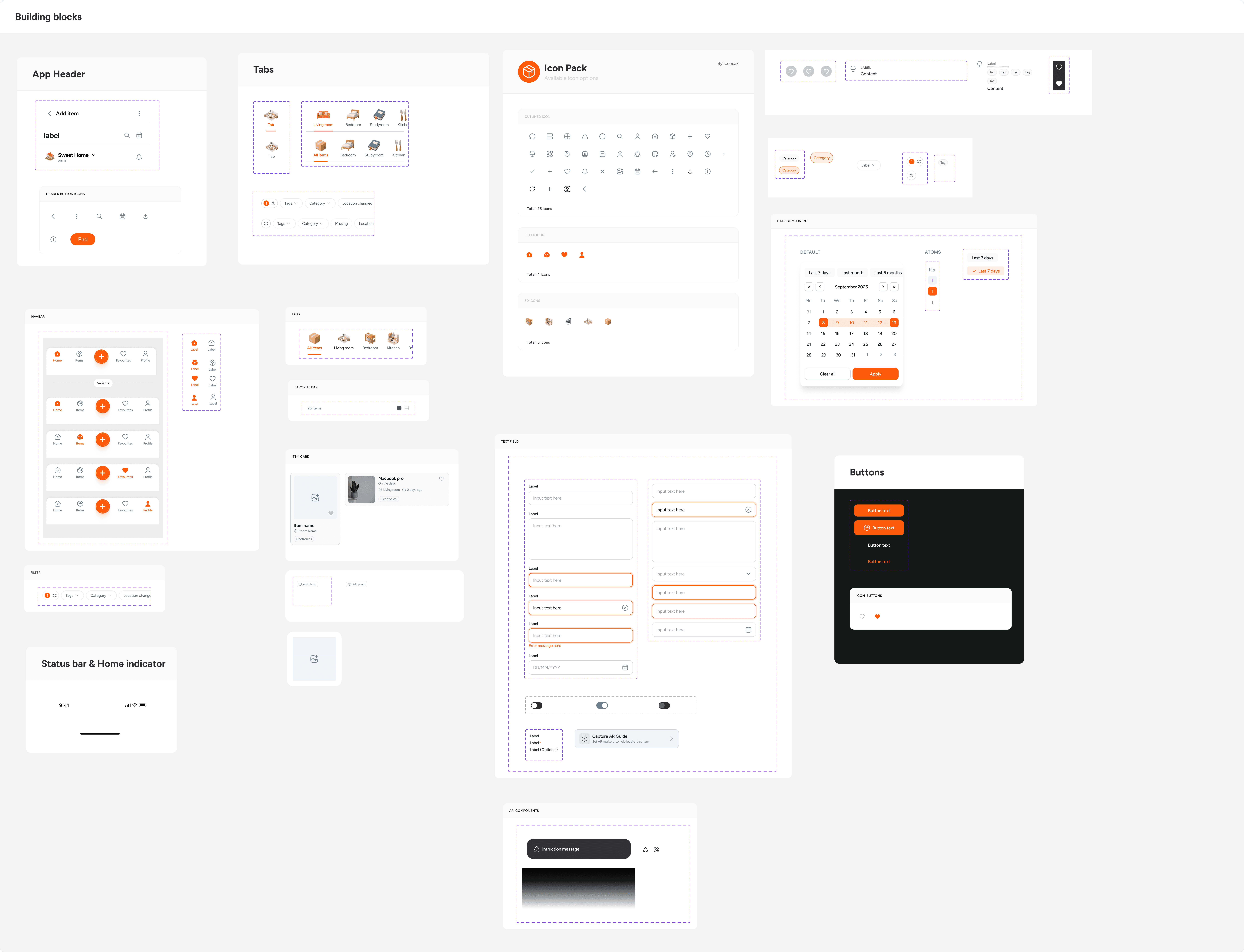
Design system
✦ Design
UI Design decisions
Here' s how I designed the experience
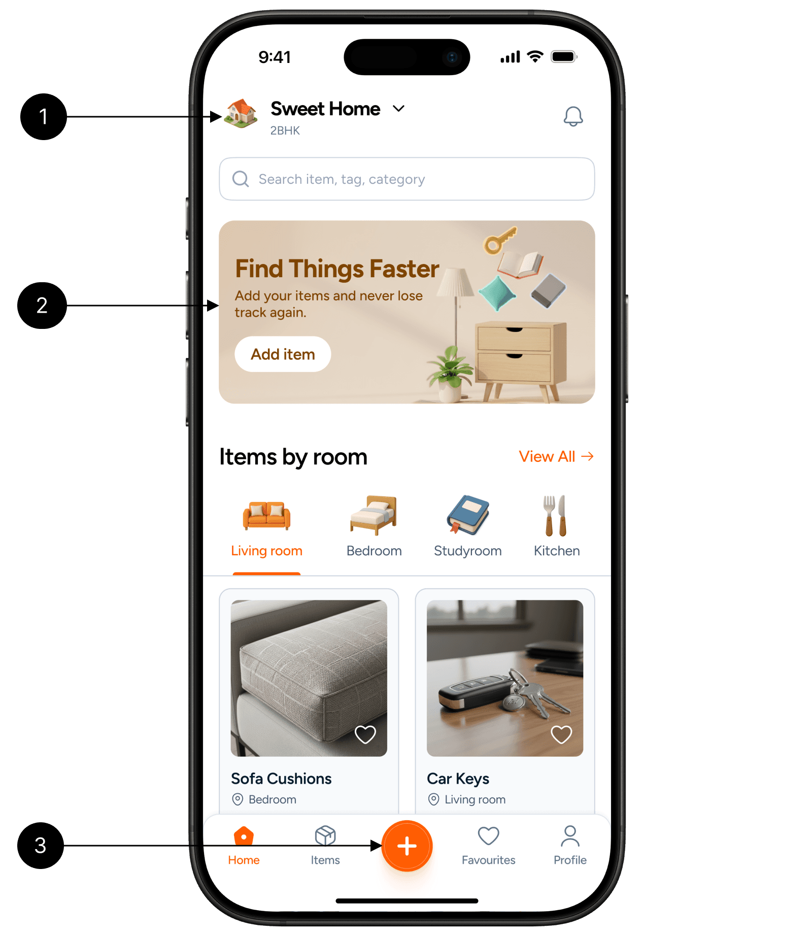
Home screen
Home selector
The home selector lets users switch between multiple home or office spaces effortlessly.
Promo banner
Encourage users to add items as soon as they opens the app, Once the user adds their first item, the banner auto-hides to reduce visual noise.
Items By room
People usually think of where they kept things in room, So I used rooms as the first section.
Add item Button
Allow user to add item, placed at the center because it’s the most used action. user can reach it easily with one hand. It’s intentionally highlighted in orange, so even new users know where to begin.
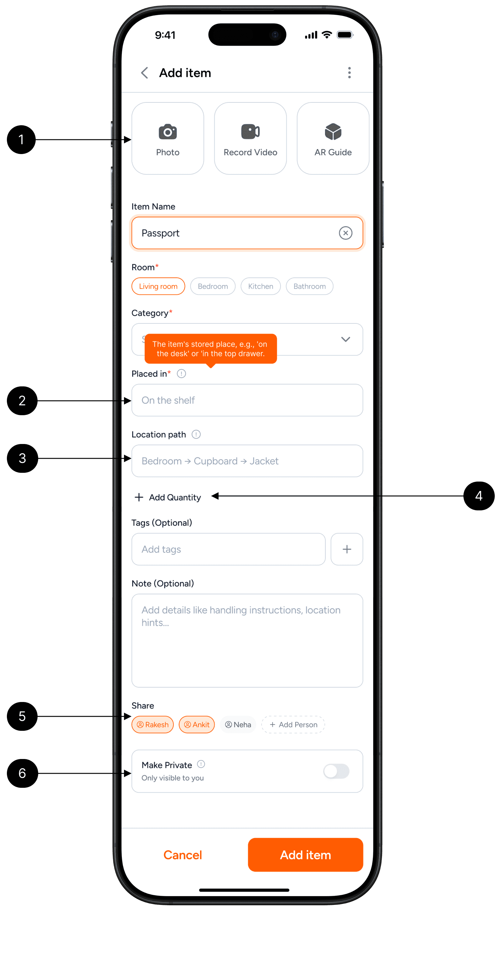
Add Media (Photo, Record Video, AR Guide)
Photo
Taking a photo helps the user remember exactly how the item looks like and where it’s kept.
It’s useful for small or similar-looking things like chargers, cables, or tools.
Record Video
Some items are stored in more complex places (like behind boxes or in a top cabinet).
Recording a short video helps capture that full path visually so users can retrace it easily later.
AR Guide
This lets users mark the item’s location using augmented reality.
Placed In
This field tells exactly where the item is kept inside the room, ex. “on the shelf”
A tooltip is added as this field may be unfamiliar to new users, it provides short hints or examples to help them fill it correctly.
Location Path
The location path connects the item to its exact physical route, such as Bedroom → Wardrobe → Top Drawer.
It helps users recall where things are at multiple levels- room, container, and inner space.
Add Quantity
Not every item needs a quantity count, so this option stays minimal.
Tapping the “Add Quantity” expands a small input to record quantity for item.
When used, it helps for items that are countable or consumable like batteries, medicines, or stationery, so users know how many they have left.
Share
Lets users share both the item and its location with others
Make Private
Used for personal or confidential items like documents or valuables.
When turned on, the item stays visible only to the owner and can be accessed anytime from Profile
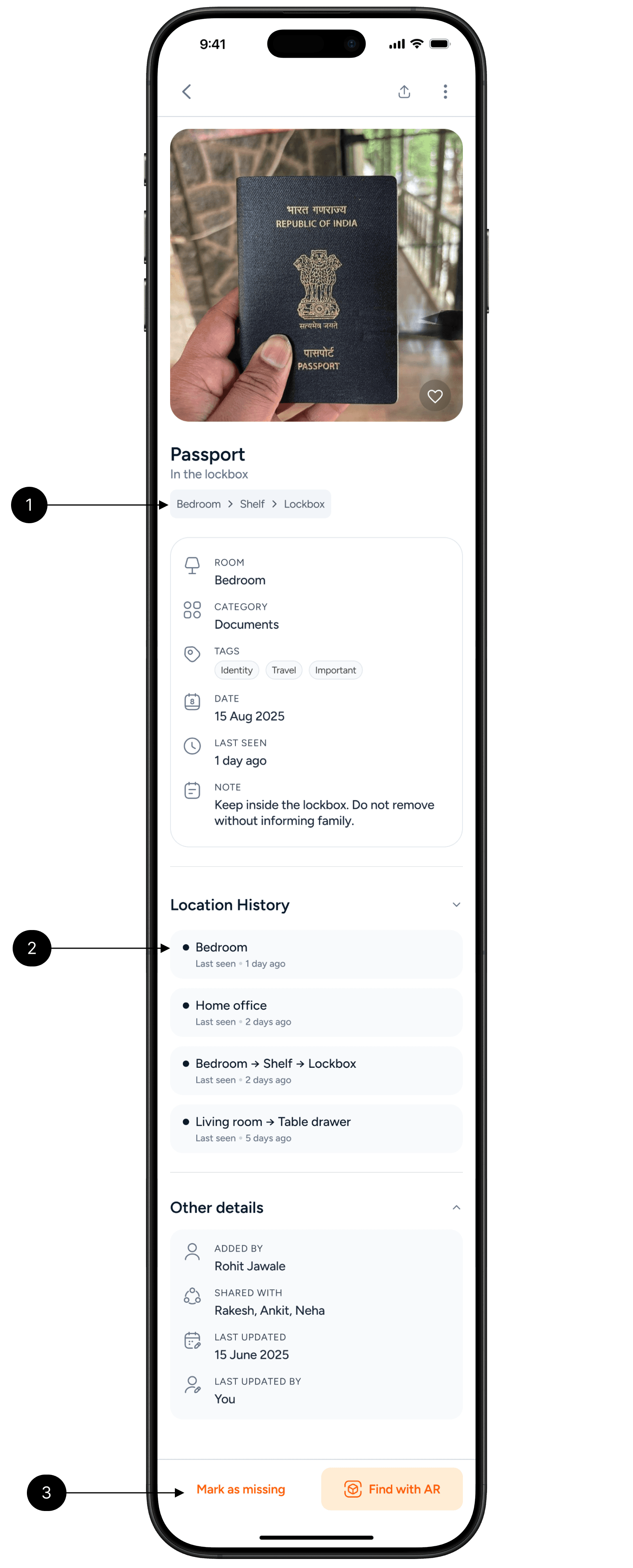
Item details
Location path
It helps users view location where things are at multiple levels- room, container, and inner space
Location History
Helps users trace back to older locations when searching for missing items.
Mark as missing
Used when an item isn’t found in its recorded spot. Marking it as missing moves the item into a separate “Missing Items” list, so users can track lost things easily without deleting their data.
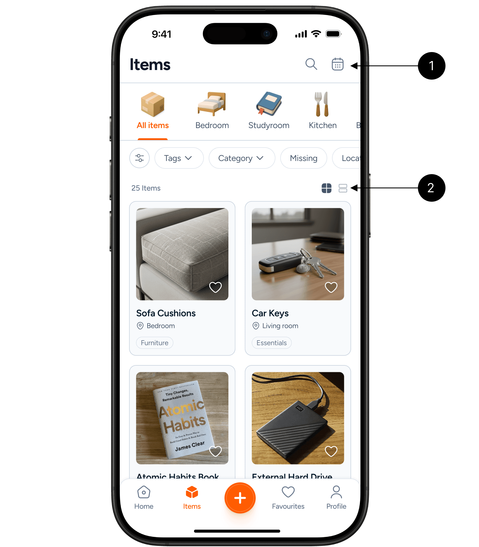
Items screen
Filter by date
Lets users sort items by when they were added or last updated.
Helps track recent changes or locate items that were moved or added recently.
Layout switcher
Grid view is the default as its supports visual scanning , users can identify items faster by image.
List view makes it easier to read details or sort through many items quickly.
Adding item using AR
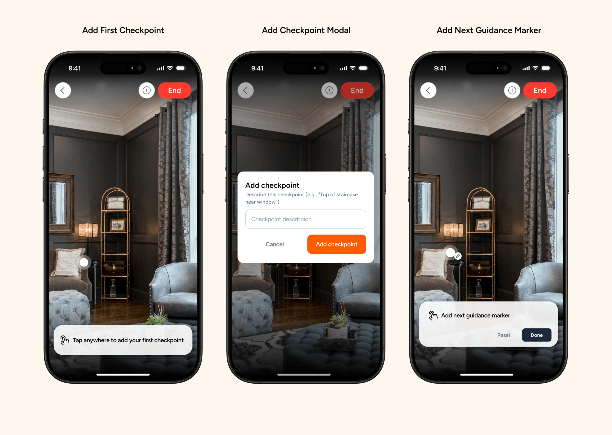
Users can also add items using the AR feature, which allows them to visually place and record checkpoints in their real environment.
The flow begins with a clear instruction “Tap anywhere to add your first checkpoint” — guiding users to start guiding users to start adding the first spot for the item.
Once a user taps on the surface, a modal appears asking for a short checkpoint description, helping identify locations later (for example, “near the window shelf” or “beside the sofa”).
After confirming, the screen transitions to the next state, where users can add additional guidance markers or finish mapping with ‘Done’. This structured flow balances clarity and immersion, making the AR item setup process simple, progressive, and context-aware.
Finding item using AR
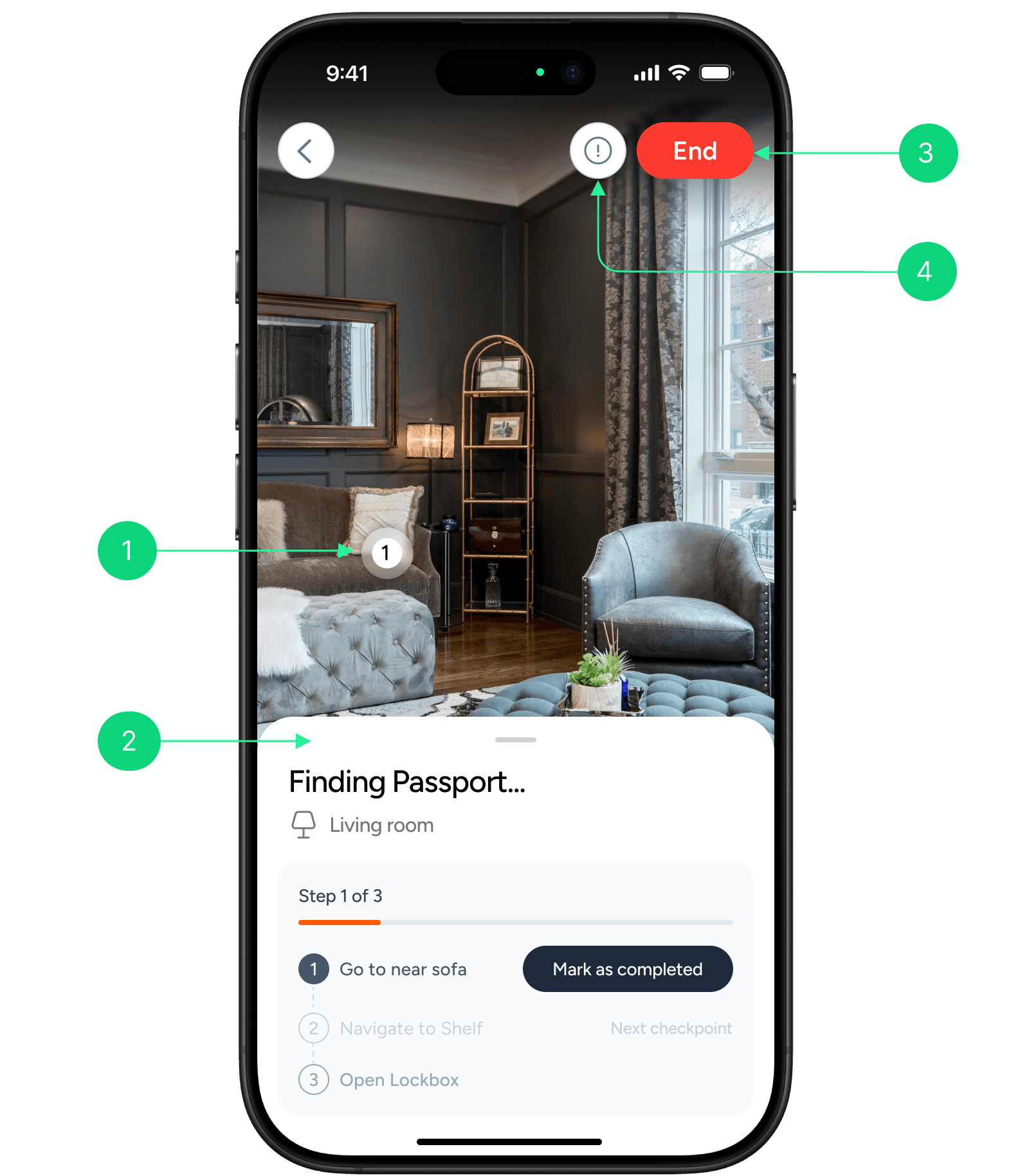
AR Marker
The AR marker shows the exact for user needs to move toward in the real world.
What it does
Standing in the center of room gives the AR a full view of the space, which makes the AR experience smoother and more accurate.
Why it’s needed
It helps users easily understand where to move inside the room without confusion or guessing.
Step progress
This section guides the user through each step to find their item easily.
What it does
It breaks the search process into small, clear steps
As users complete a step, they can mark it done and move to the next one.
Why it’s needed
Finding items can involve multiple actions or spots in a room. Showing progress helps users know what to do next and how close they are to finding the item.
It also keeps the AR experience simple and focused instead of overwhelming the user with all directions at once.
End AR session
End the AR session kept on top right position to avoid accidental clicks
Help button
It Provides guidance or troubleshooting info during AR use.
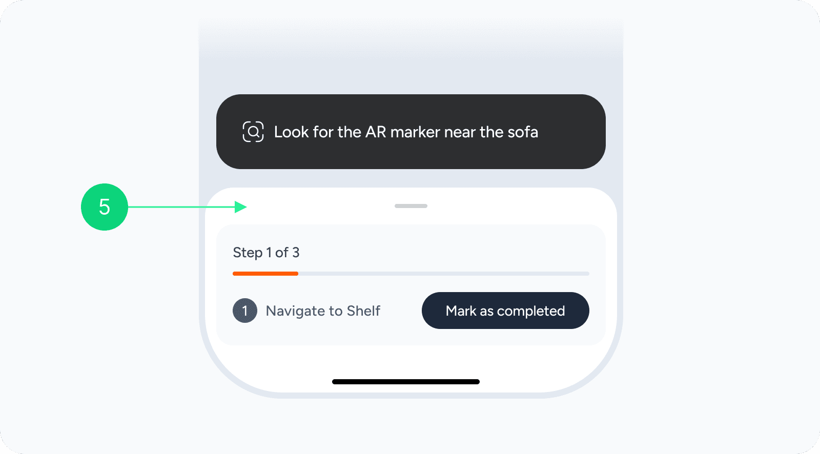
Collapsed Bottom Sheet
The collapsed bottom sheet gives users a quick view of their current step without blocking the AR camera view. It helps them stay focused on their surroundings while still being able to track progress or mark a step as completed. This balance keeps the interface clear and easy to use during the AR experience.
Expanded bottom sheet
Collapsed bottom sheet
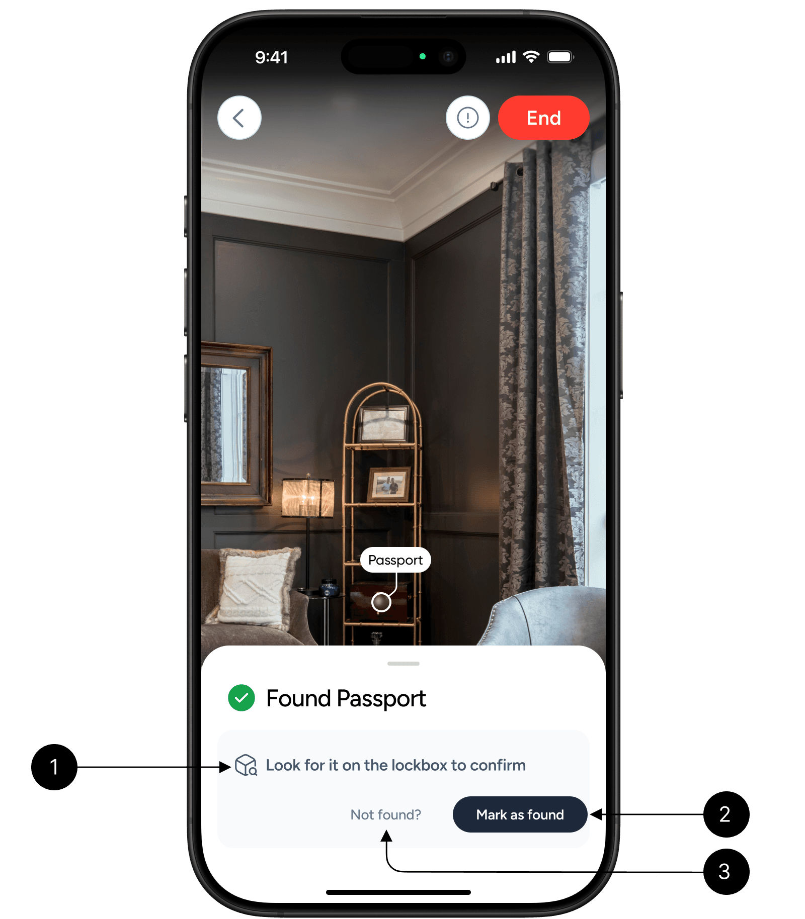
Item found Confirmation
Confirmation Instruction
Reminds the user to visually check the item’s actual location before marking it as found.
Mark as found
“Mark as Found” lets the user confirm that the item has been located in the right spot, completing the search flow.
Not found
If the item isn’t visible or the AR marker seems misplaced, the user can tap “Not Found” to report it and trigger a recalibration or correction step.
This gives users control to verify accuracy, ensuring the AR system learns and improves over time while keeping the experience reliable.
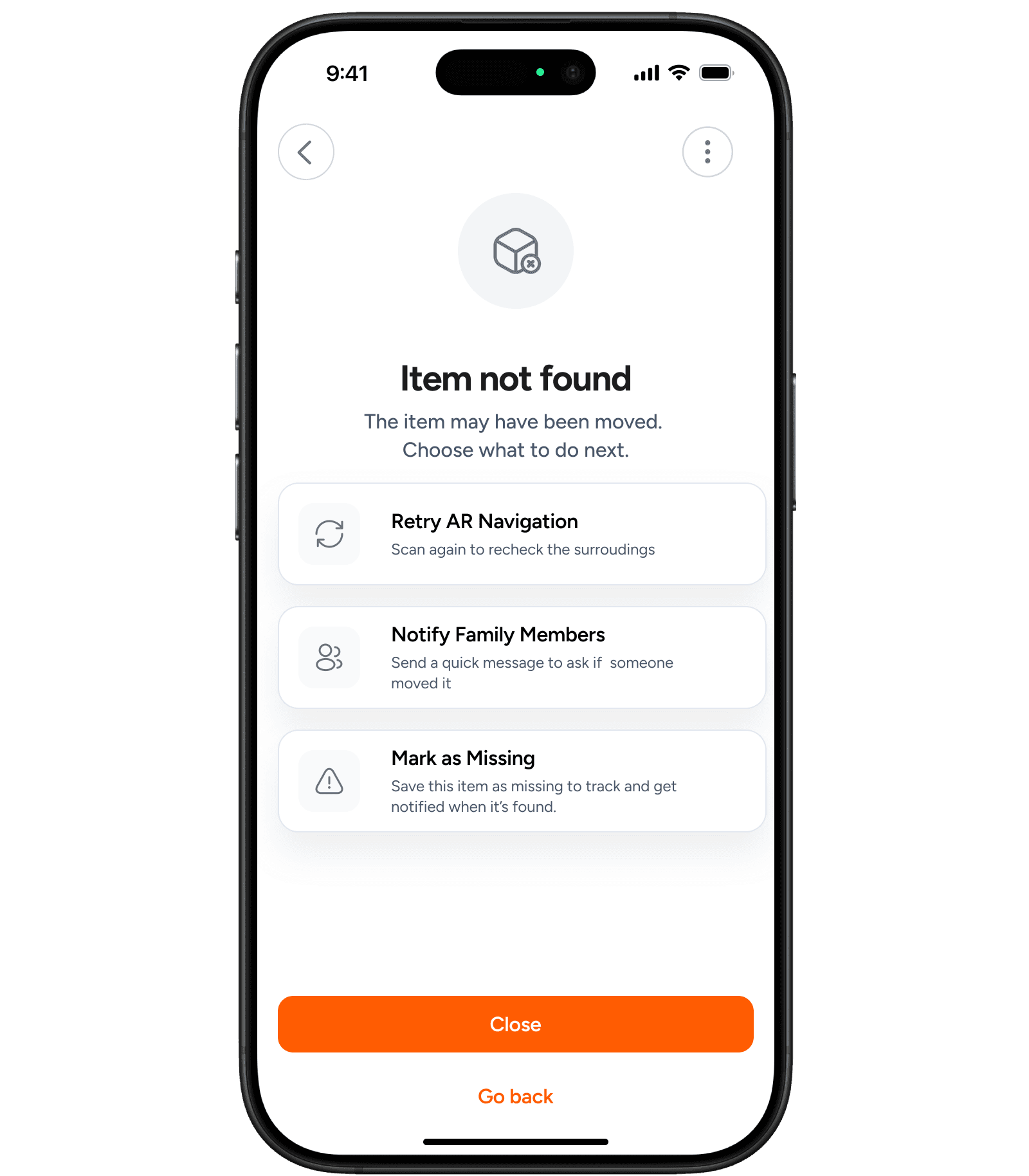
Item not found
This screen appears when the app cannot detect the item in its usual spot. It helps the user understand that the item might have been moved and offers different options to handle it.
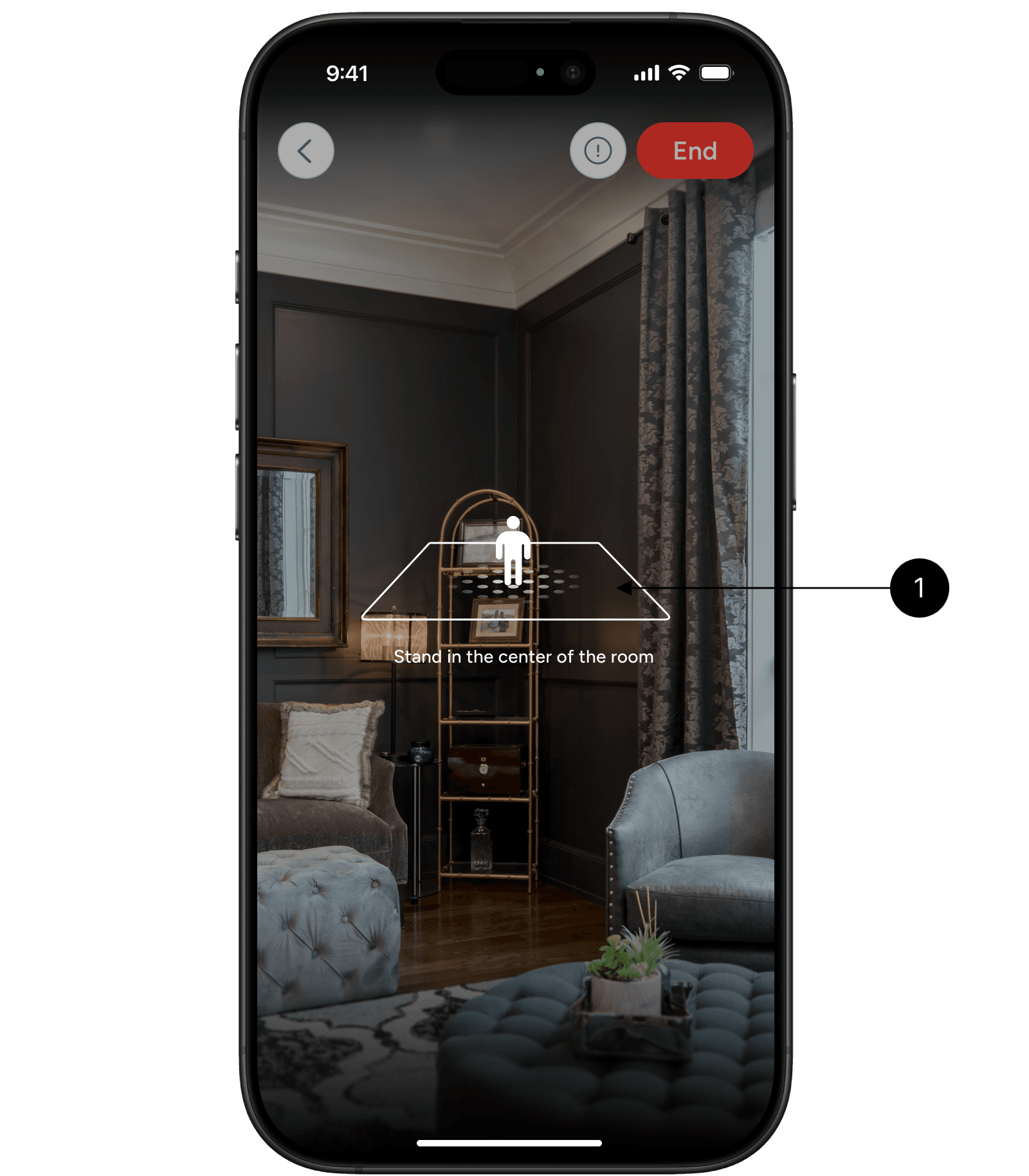
AR Calibration screen
AR Calibration
It shows an instruction asking the user to stand in the center of the room.
Why
Standing in the center of room gives the AR a full view of the space, which makes the AR experience smoother and more accurate.
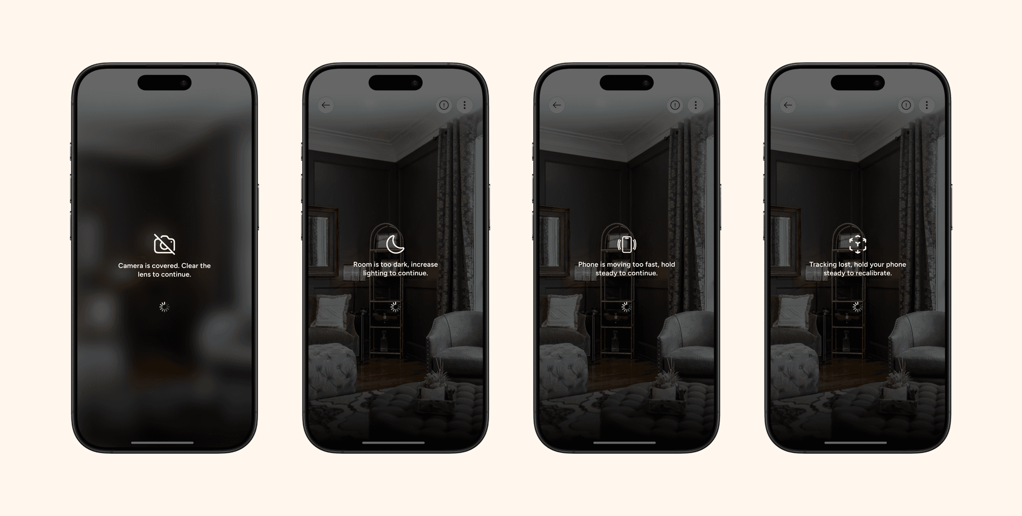
Edge cases
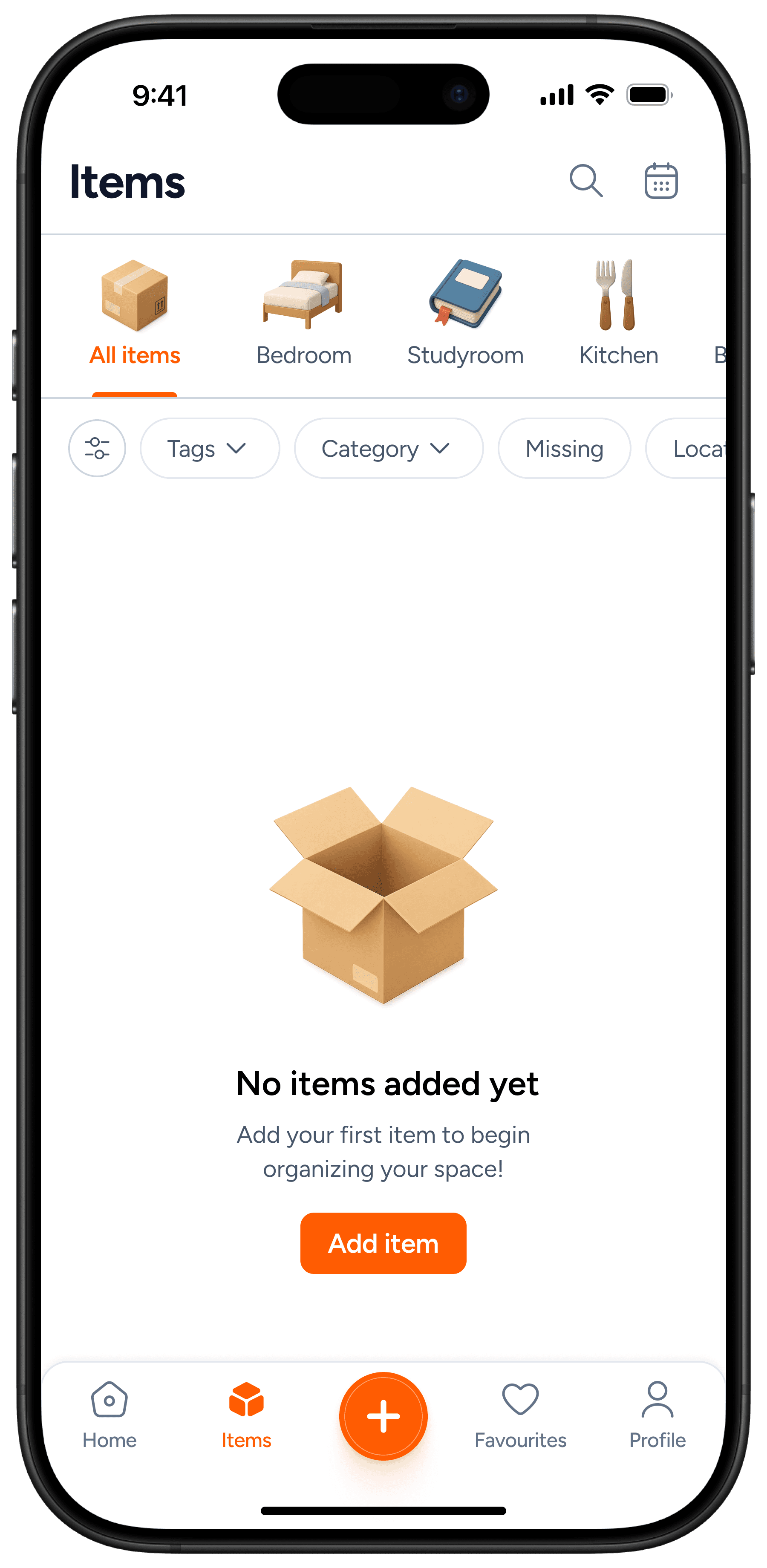
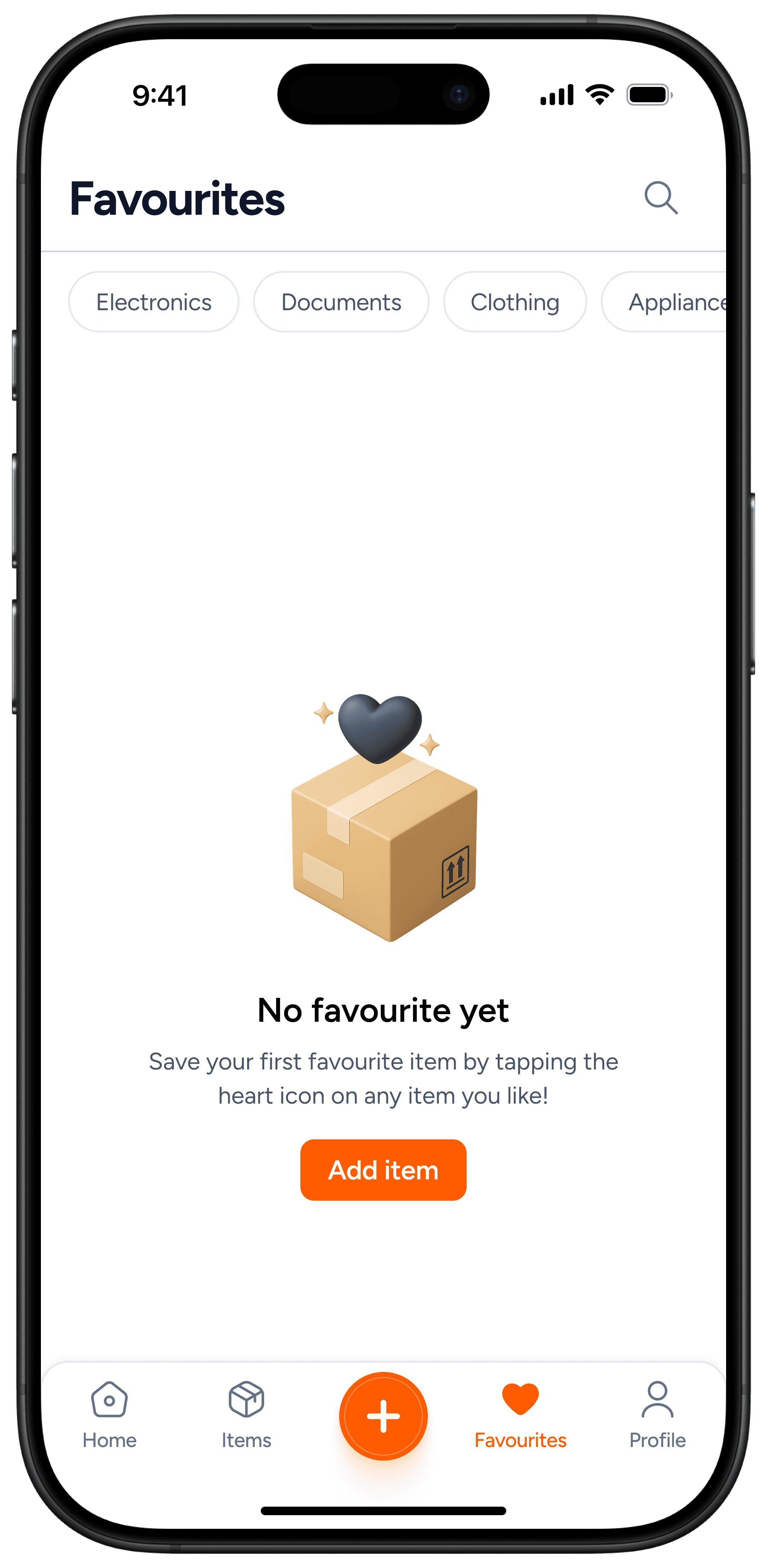
Empty states
I also considered the empty states. Included CTAs to ensure the user doesn't get stuck in that state.
Items not added
No favorites
Success Metrics
To measure the impact of the AI Chat Summarization feature, I’m focusing on metrics that reflect better understanding, quicker catch-up, and deeper engagement.
Add Item Quickly
Users should be able to add an item within 15 seconds

Finding item
Users should be able to find any item using the location path
💬
Reduced Search Time
The overall time users spend searching for misplaced items at home should reduce by at least 50%.
Learnings
This project gave me a great chance to dive deeper into app design and explore how every use case shapes the overall experience.
Here’s what I learned
Working on this project helped me understand how small design decisions can make a big difference in how users experience the product.
Designing an experience around AR was something completely new for me. I learned that while AR feels advanced, users still expect simple and familiar interfaces.
Through iteration, I learned how important it is to follow familiar UX patterns.