2025
B2B, B2C
SaaS
AI Summaries for WhatsApp: A UX Case Study
AI-powered feature that helps WhatsApp users catch up on missed messages faster - designed as a personal UX project.
My Role
Product designer
Timeline
6 Months
Team
Only me
Context
WhatsApp is one of the most widely used messaging apps globally. Users are part of numerous chats, including family, friends, work, and interest-based groups. Over time, unread messages pile up, and users miss important context or have to scroll endlessly to catch up. The AI chat summaries feature aims to reduce message fatigue and highlight what matters most with contextual summaries.
Problems Identified

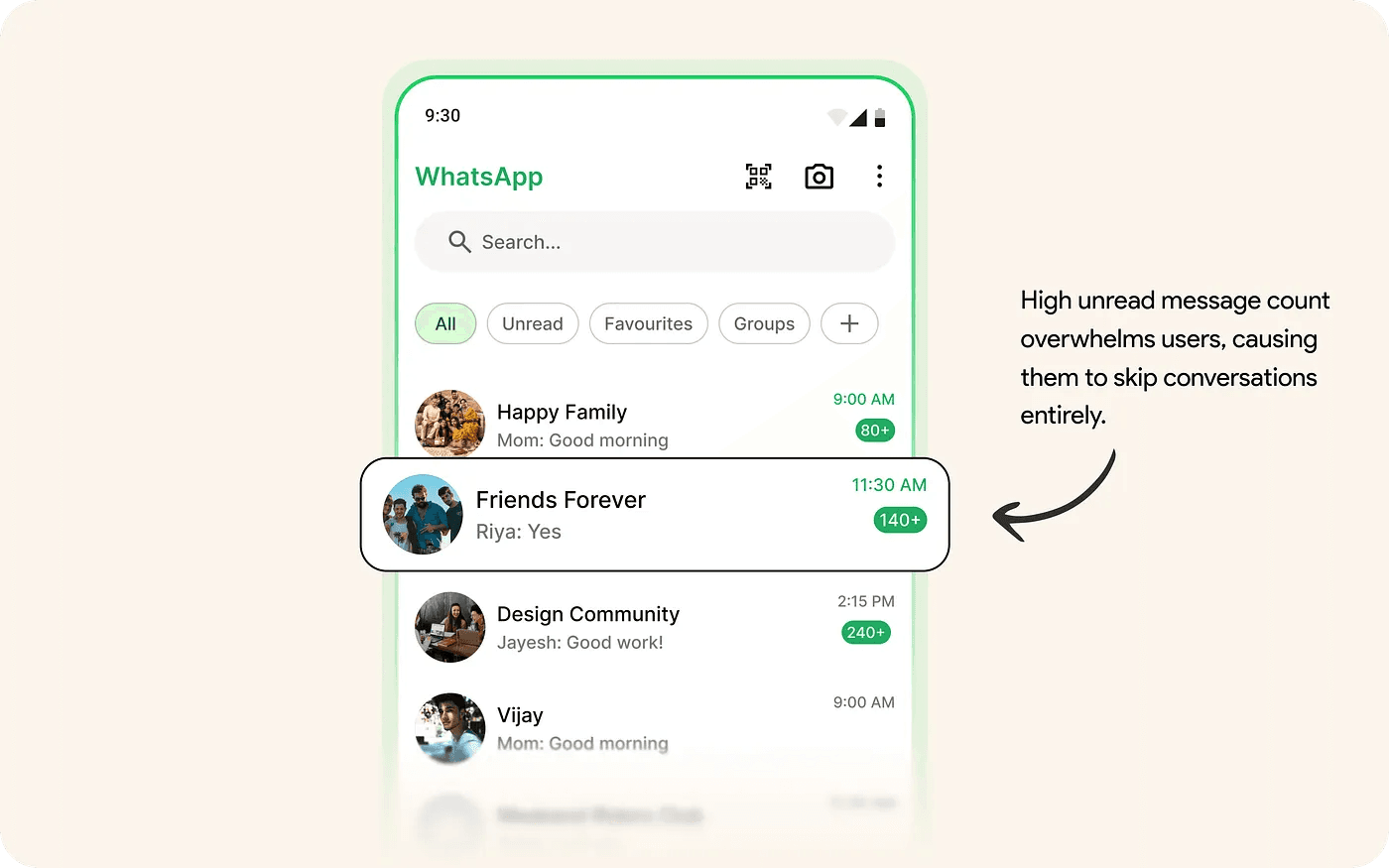
Users feel stressed seeing the unread message count.

Skipping long chat threads leads to missing key updates.

Catching up in group chats takes time due to too many chats
Who faces this problem?
Busy users
In large group chats (15+ members)

Working professionals
Returning to their phones post-meeting

Family members
Checking chats only a few times a day

Travelers & offline users
Rejoining after network or travel breaks

Goal
Design an Al feature that enables users to understand what they missed in WhatsApp chats.
Design Goals

Awareness

Clarity

Depth

Interactivity
Primary Research
To validate assumptions and uncover deeper insights, we conducted user interviews from 6 people
User interviews
Working professionals

Students
Homemaker
Retired senior
Key Finding
We observed how 3 users scrolled through long message threads
Insights gained

Users prefer quick, structured info
What’s the summary - not the whole chat
💬
People want to ask follow-up questions naturally
What time is dinner?

Use Familiar UI patterns
Like WhatsApp’s style help faster trust.
Solution
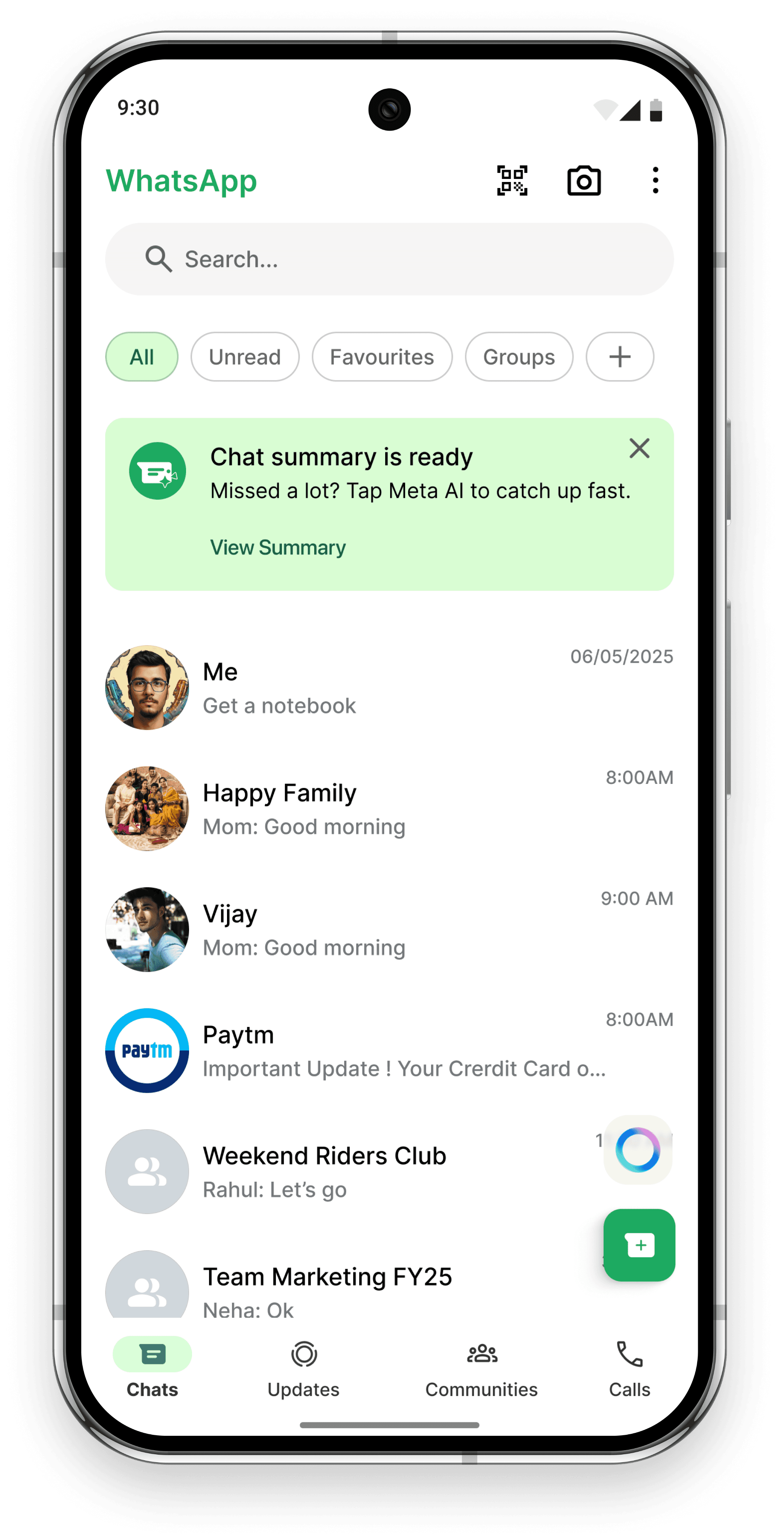
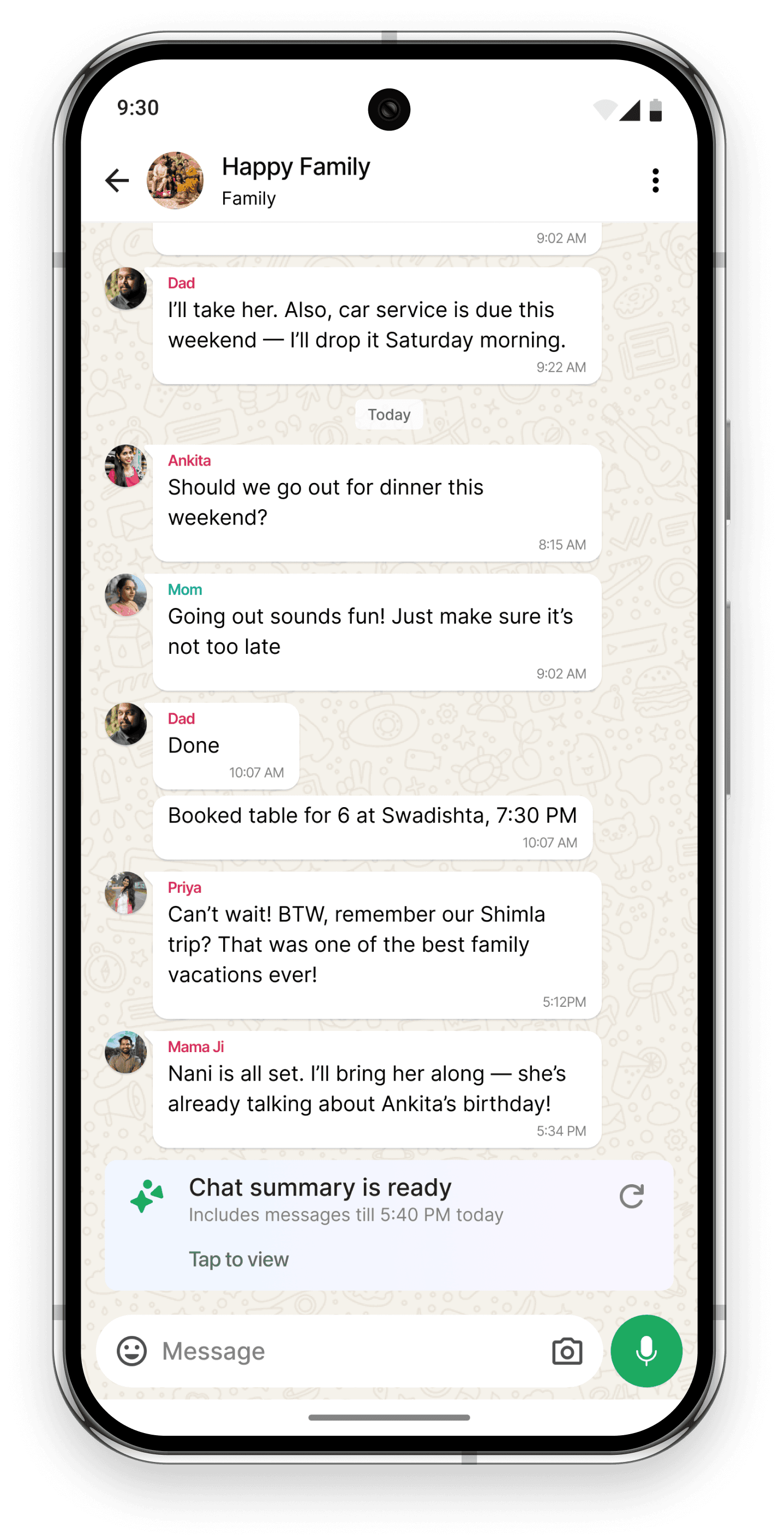
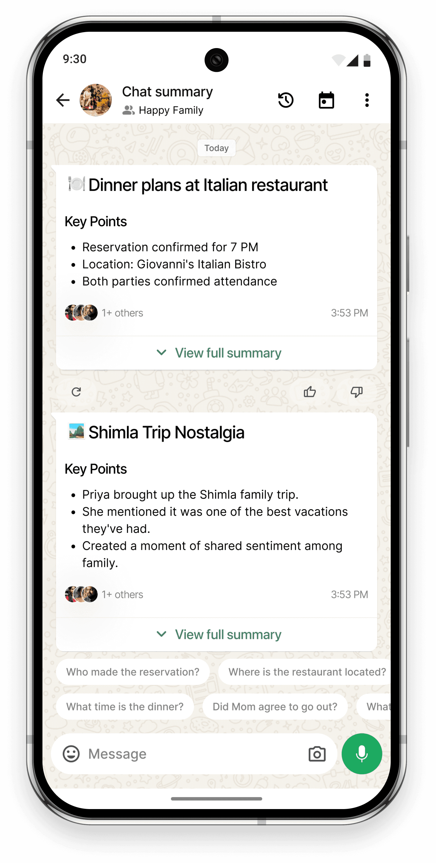
AI will summarize unread or recent chats into topic cards with key points, message context, and related follow-up questions.
User Flows
To ensure the AI summaries are accessible and intuitive, I’m focusing on four key user flows. Each path reflects a different user entry point depending on their intent , whether they’re reacting to unread messages, catching up globally, or exploring past discussions.
01.
Specific Chat Summary
This is the most common path for users catching up on missed conversations in individual or group chats.
It provides a focused, context-rich summary with follow-up questions.
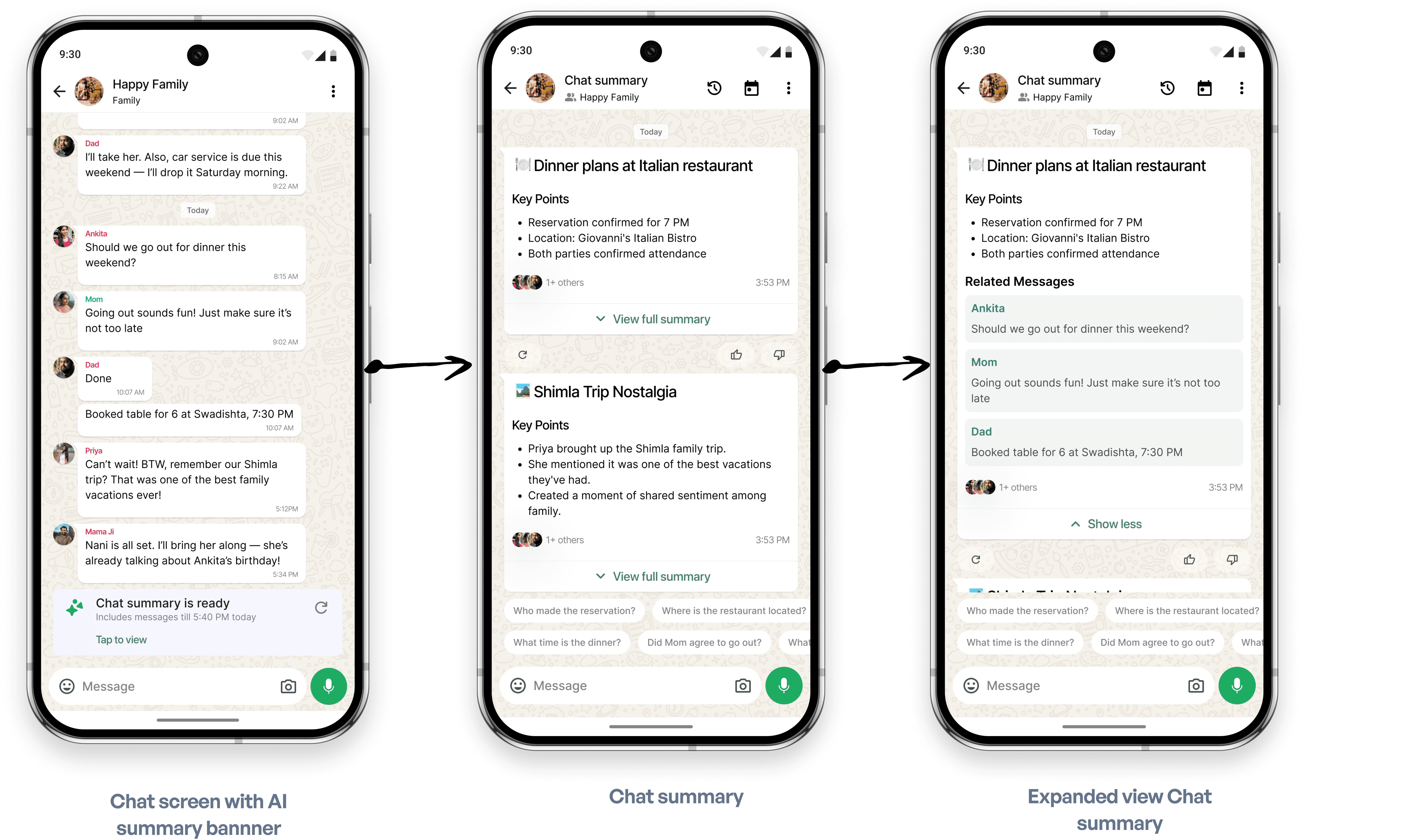
Chat summary flow
02.
Chat Summary
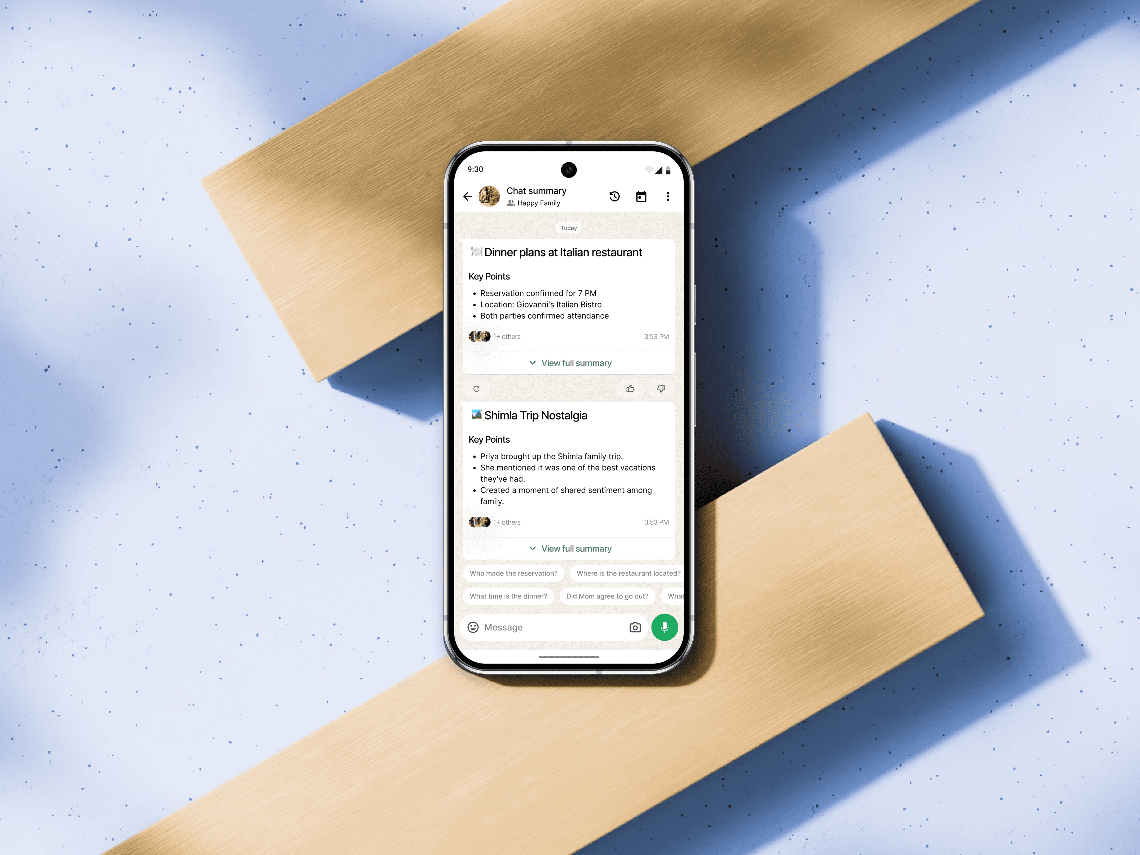
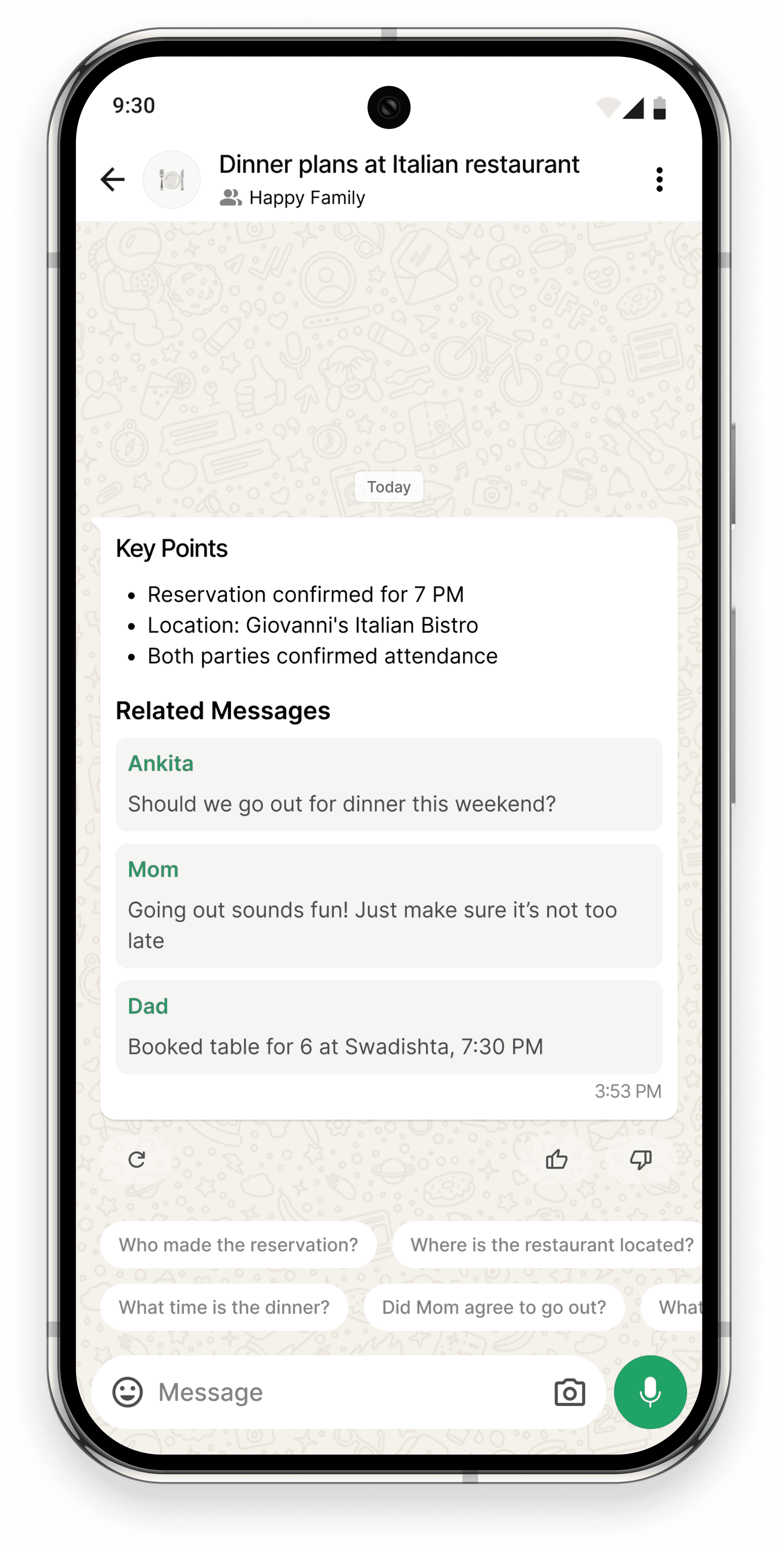
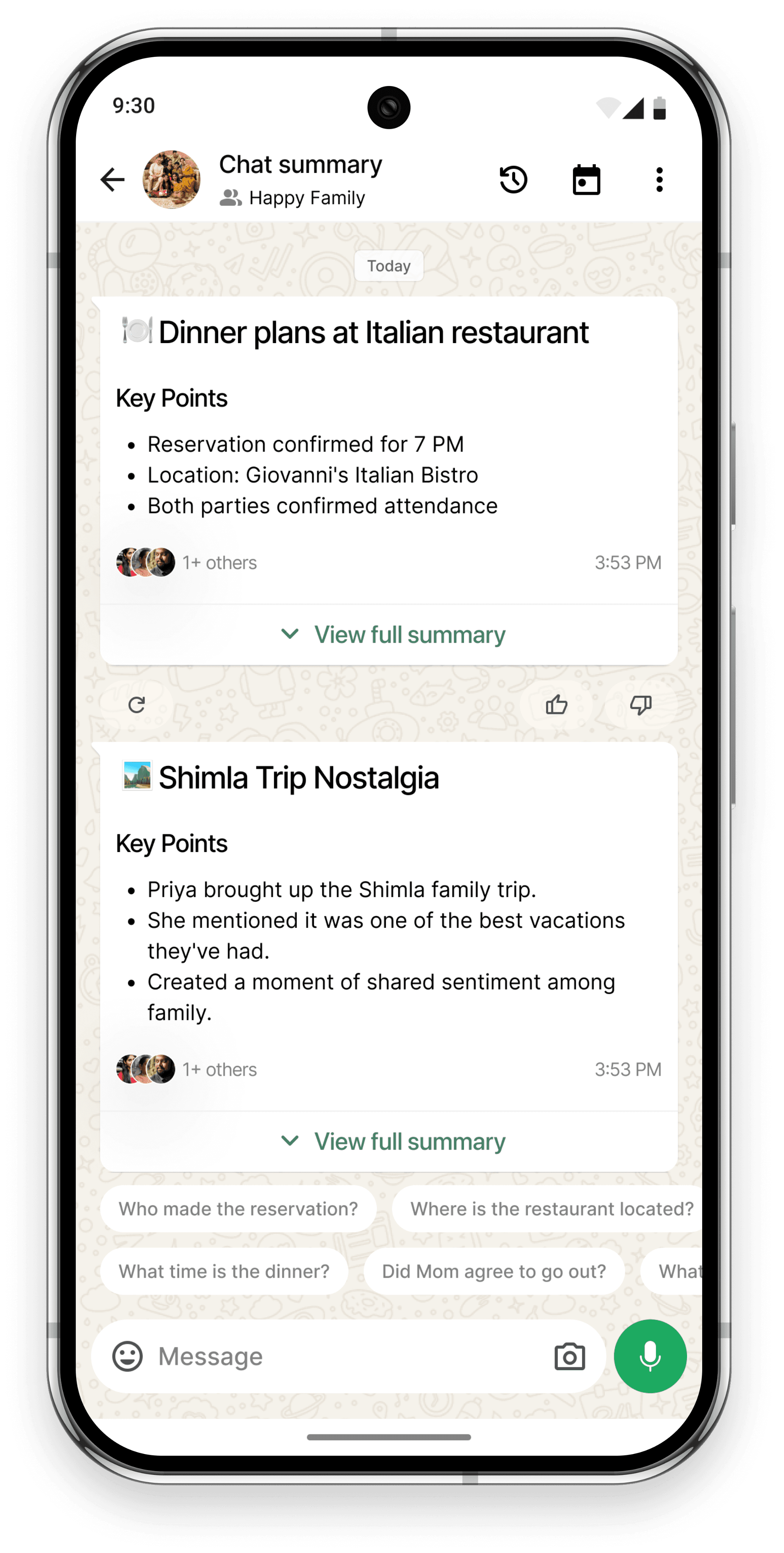
Chat Summary screen helps users quickly catch up on missed messages. Each card starts with a short topic title showing what the chat was about.
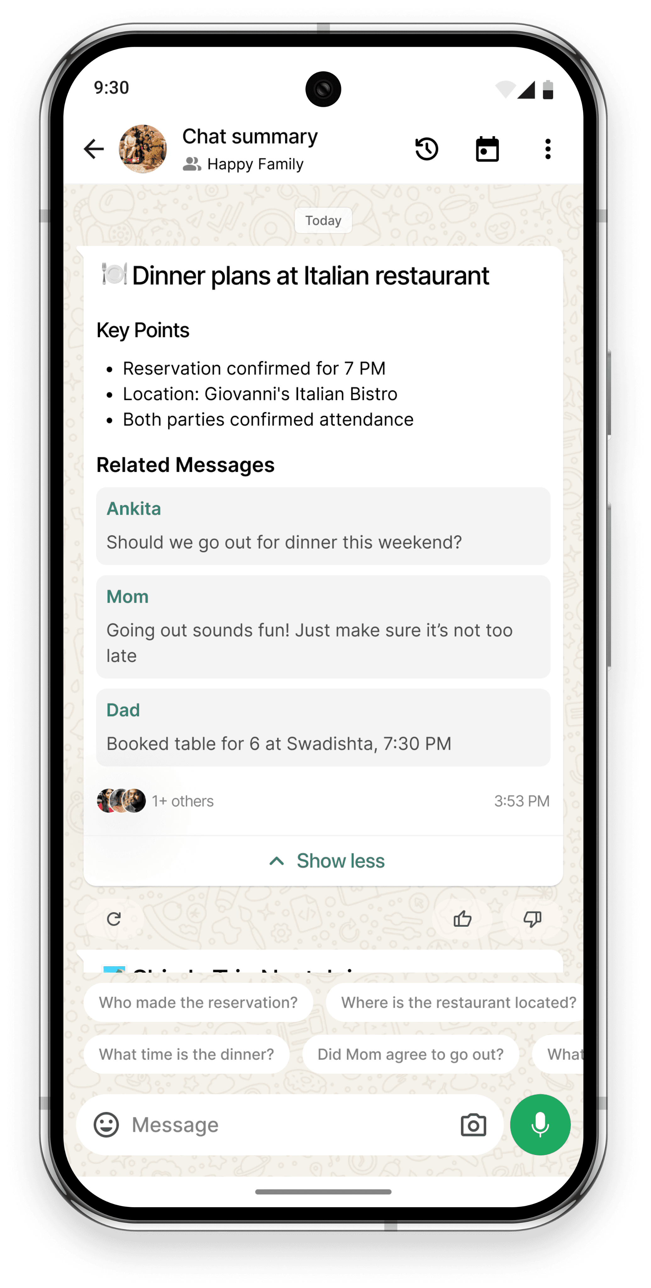
Key points are listed below so users can understand the main updates without reading everything. Users can tap “View full summary” to see more details from the chat.
If new messages come in, they can refresh the summary with the “Re-summarize” button. Feedback buttons let users guide the AI and get better summaries over time.
There are 2 ways a user can access chat summaries
Quick view
Chat Summary
User opens a chat
Sees “Chat summary is ready” banner
Taps the banner
Lands on Chat Summary screen
Sees topic cards with key points only
User Can scroll and quickly catch up without expanding any topic
Detailed view
View Full Summary
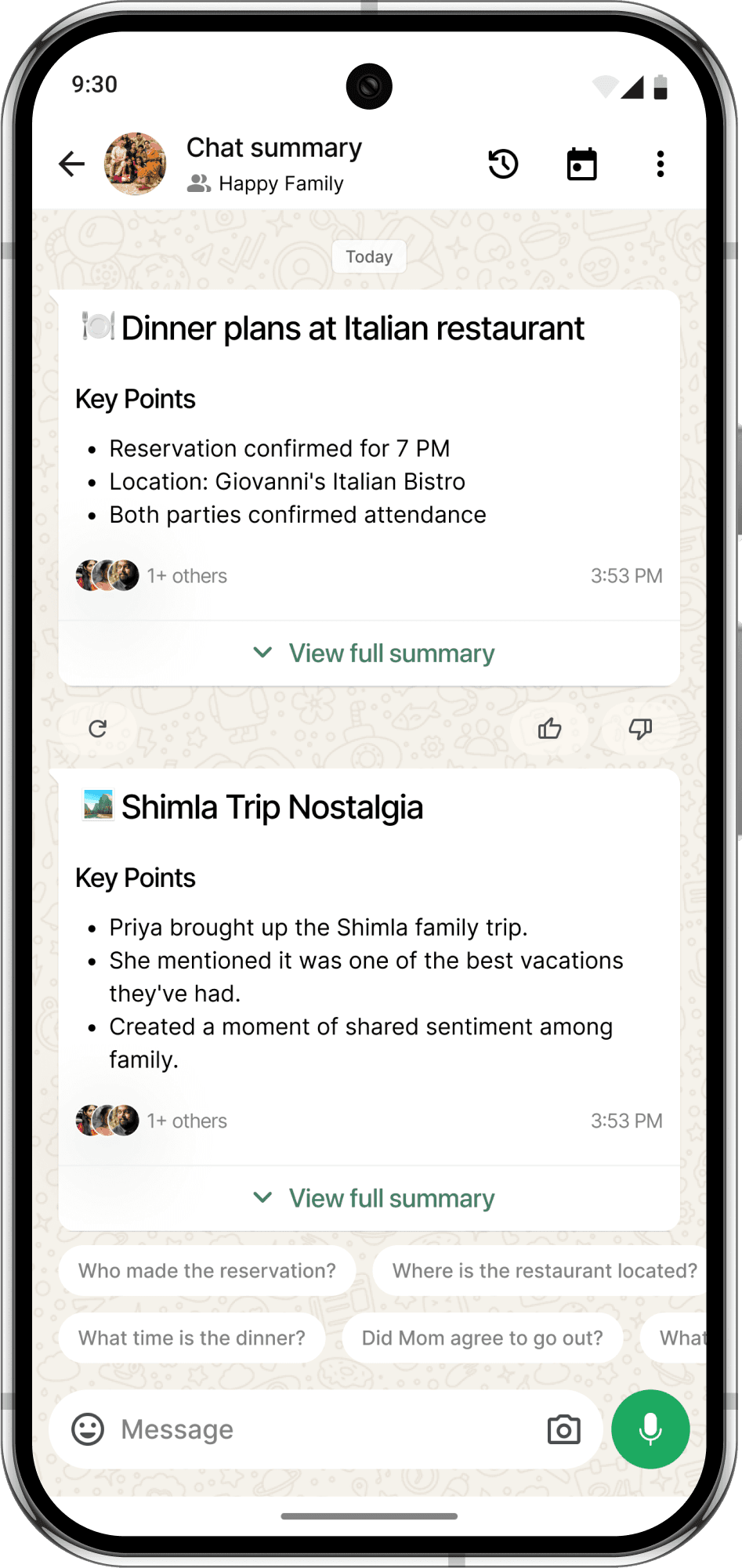
Anatomy of a Chat Summary
Topic Card Title
Appears at the top of each card
AI-generated title shows the main topic
Helps users quickly spot topics, especially when many chats happen at once
Key Points Section
Bullet points show the most important parts of the conversation
Highlights things like time, decisions, and who said what
Lets users read fast without opening the full chat
View Full Summary Toggle
A collapsible section that expands the topic card
Tapping shows the original messages used in the summary
Good for both quick reading and deep context
Re-summarize Button
Appears when new messages come in after a summary is made
Lets users refresh the summary manually to stay updated
Feedback Buttons
Helps users guide the AI to improve summaries
Tapping gives more detail from related messages
Works in both short and expanded modes
1
3
5
2
4
Chat summary Iteration
To design AI summary main screens, I had to design multiple approaches to solve the problem
Each component was iterated multiple times, taking into account
The total number of steps to access the summary and read them
Matching with the existing WhatsApp core UI
I’m showing two main iterations I came up with
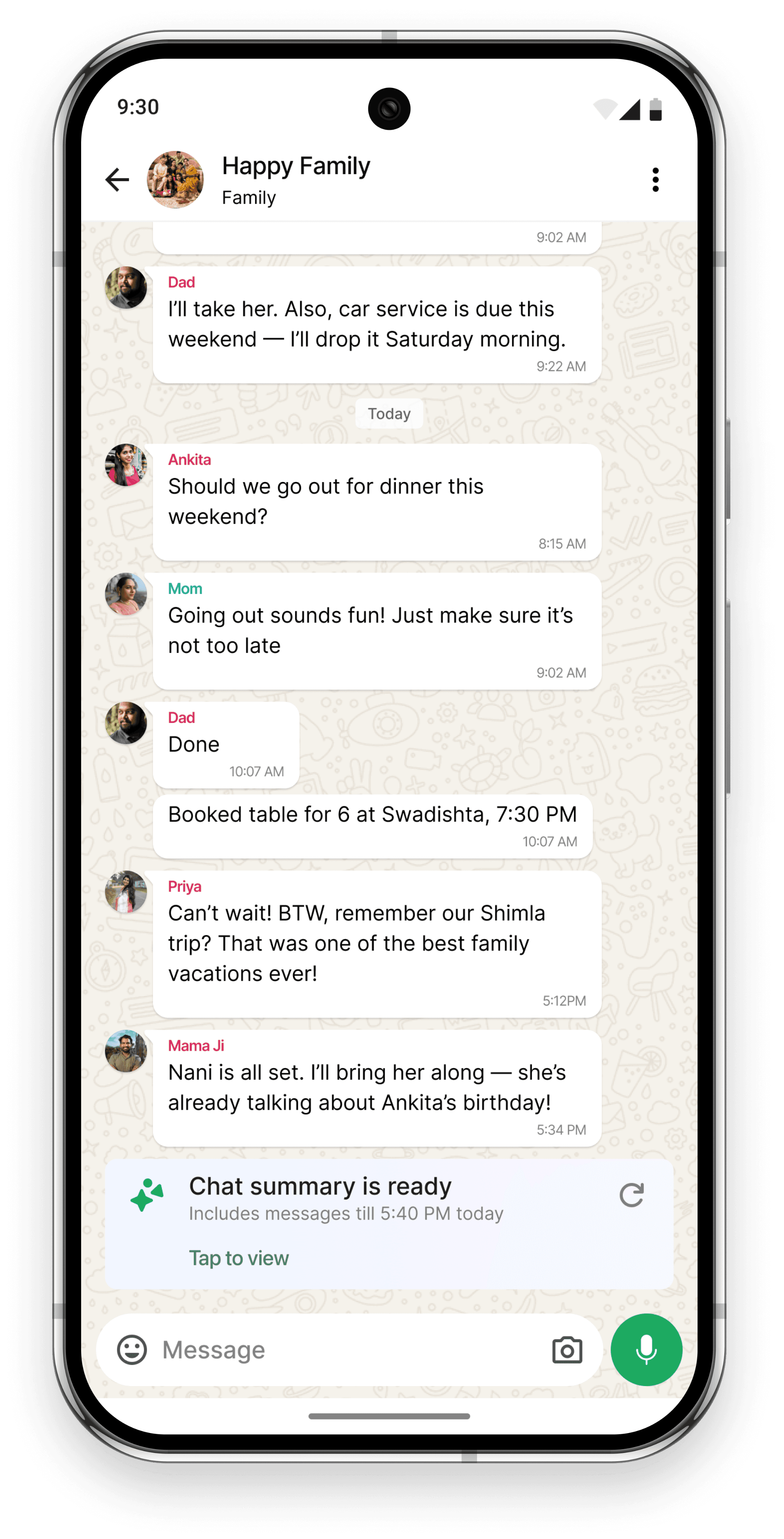
Iteration 1
A summary banner appears inline at the bottom of the chat.
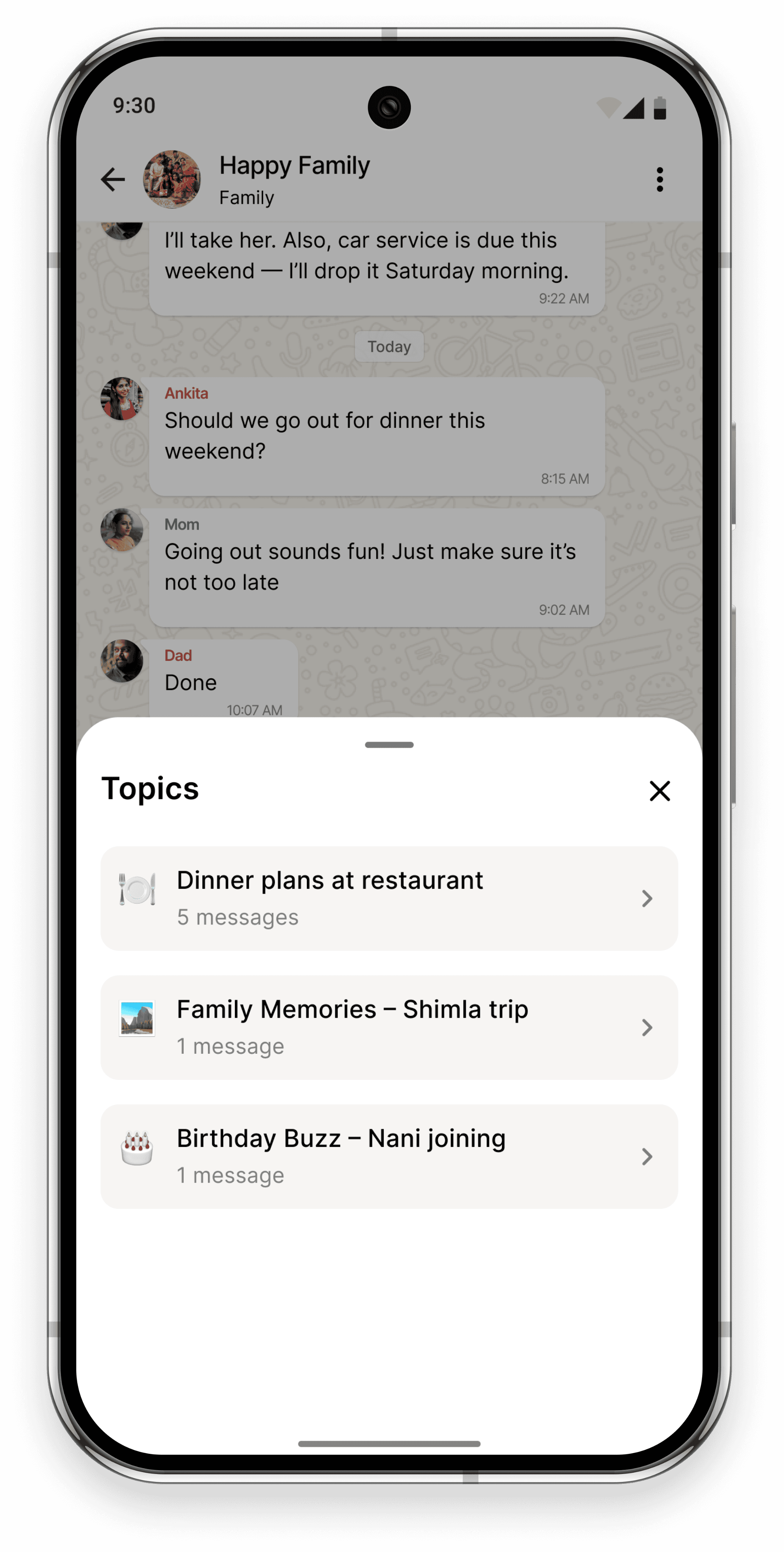
Tapping it opens a modal with topics.
Displays a bottom sheet with topic titles.
Each topic shows a message count, acting as a hint about activity level.
Opens a new screen with detailed Key Points and Related Messages.
Why this didn’t work?
Opening a modal and then a separate screen added too many steps to access the summary.
The modal hides the chat UI, which breaks WhatsApp’s natural reading experience.
The topic detail view introduces a deep navigation flow, which becomes hard to manage when adding features like history and filter by date
Topic-based screens felt disconnected from how WhatsApp works,
WhatsApp has a flat structure where screens are either chats, groups, or communities.
No way to see all summaries in one scroll. You have to jump back and forth between topic list and detail views.
The flow felt heavy and slowed users down instead of helping them catch up faster.
Iteration 2
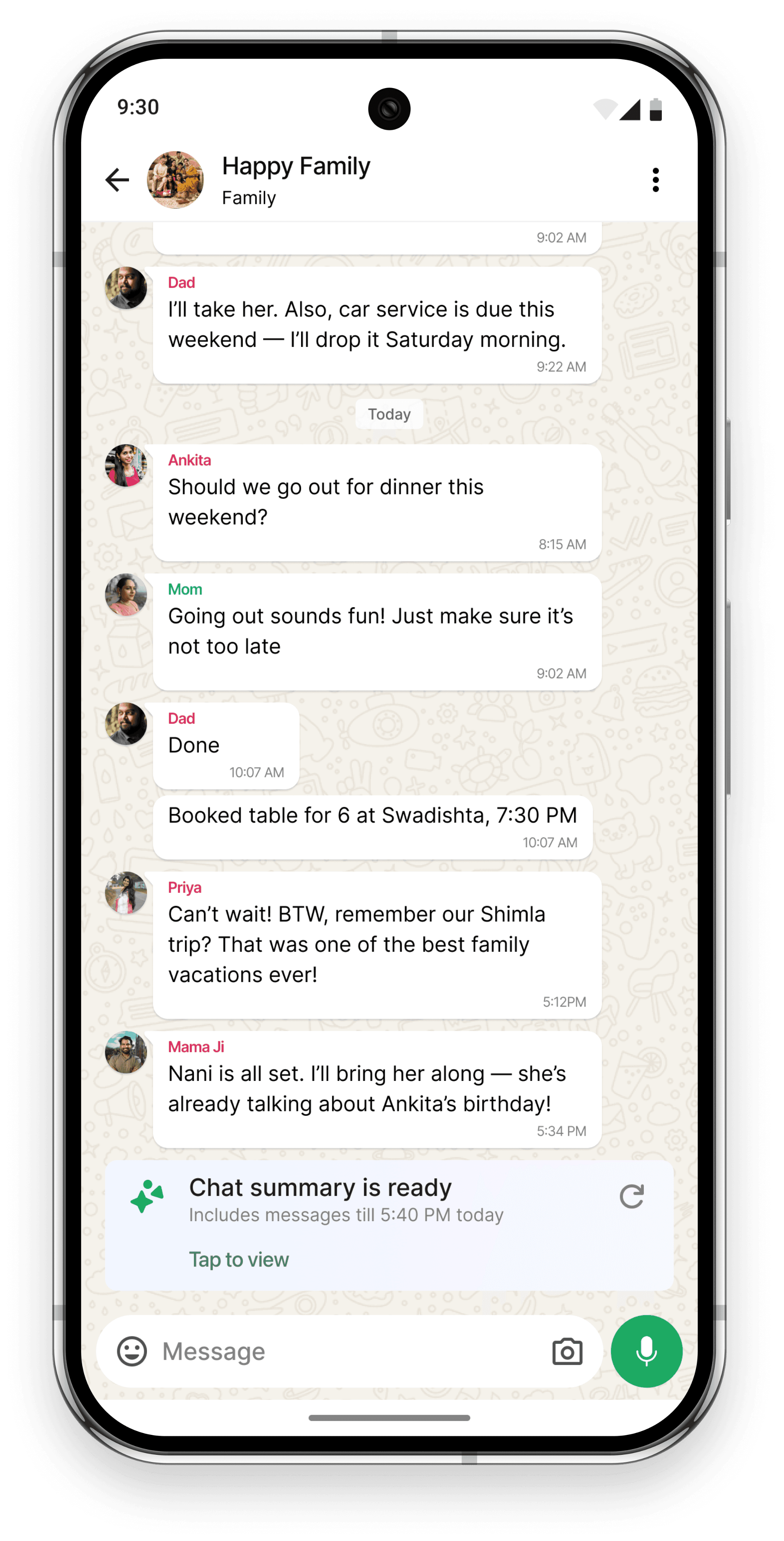
Chat summary appears inside chat.
Re-summarize button appears if chat updates, keeping summary fresh.
Lets users quickly scan multiple conversation topics.
Saves time by showing key points without scrolling full chat.
Reduced chat catch-up time.
Shows full context with original messages and key points.
Follow-up questions improve understanding without extra scrolling.
Follow-up questions : Higher interaction, better AI trust.
Why this worked better
Entire summary experience stays within the chat, reducing friction.
Supports quick scan via cards and deeper exploration with toggles.
Fewer taps to see key information → aligns with the goal to reduce catch-up time.
Matches WhatsApp’s native style, increasing trust and familiarity.
Helps success metric:
Users engage faster with fewer steps and more control over how much to read.
The flow felt heavy and slowed users down instead of helping them catch up faster.
03.
Global Chat Summary
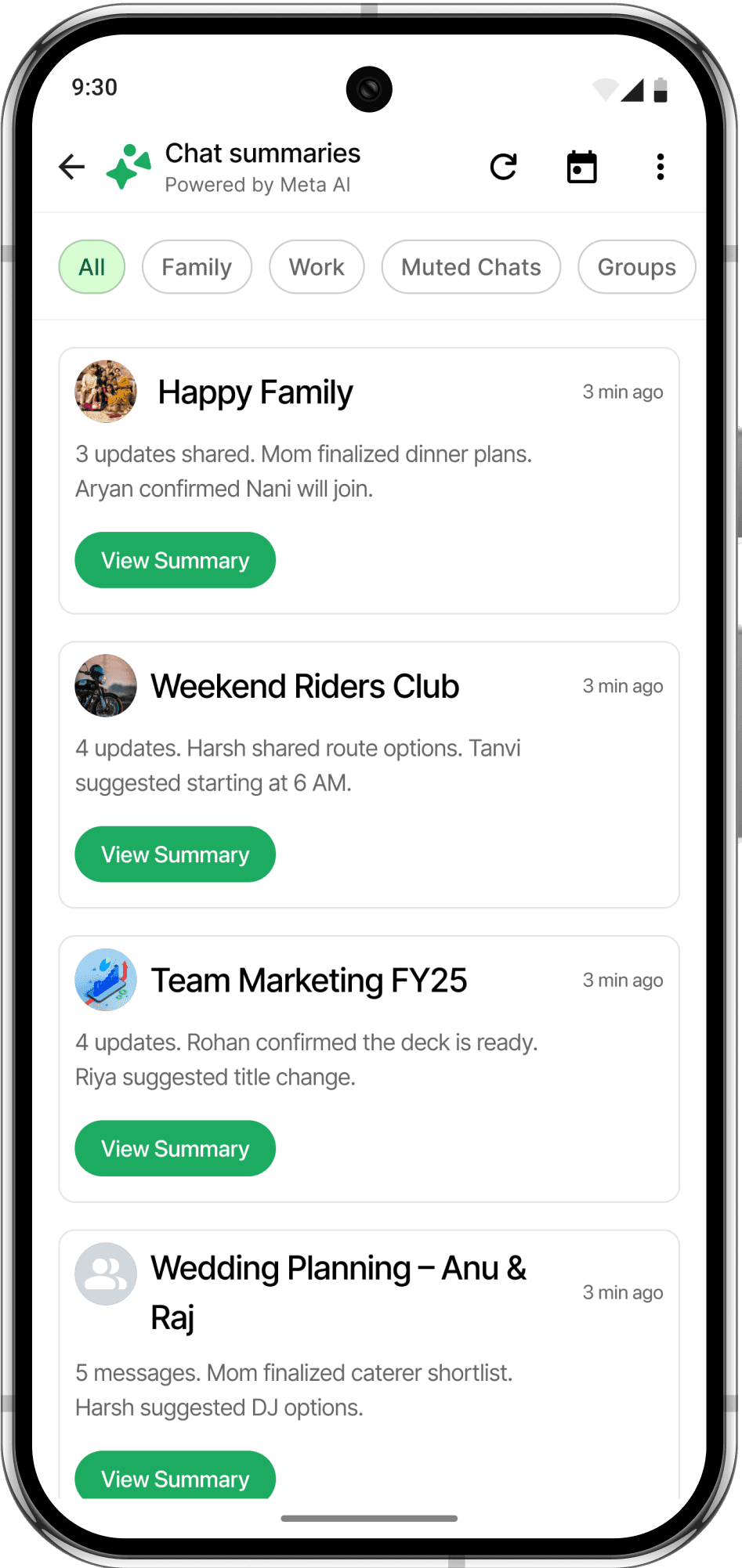
This gives users a quick overview of all chats with recent updates. Instead of jumping into each chat, users can see short summaries grouped by conversations, making it easier to prioritize where to catch up first.
Each card shows the chat name, a short summary line, and a clear “View Summary” button to dive deeper.
Filter chips at the top let users narrow summaries by chat type or date. This helps users avoid feeling lost when returning to WhatsApp after being away for a while.
userflow
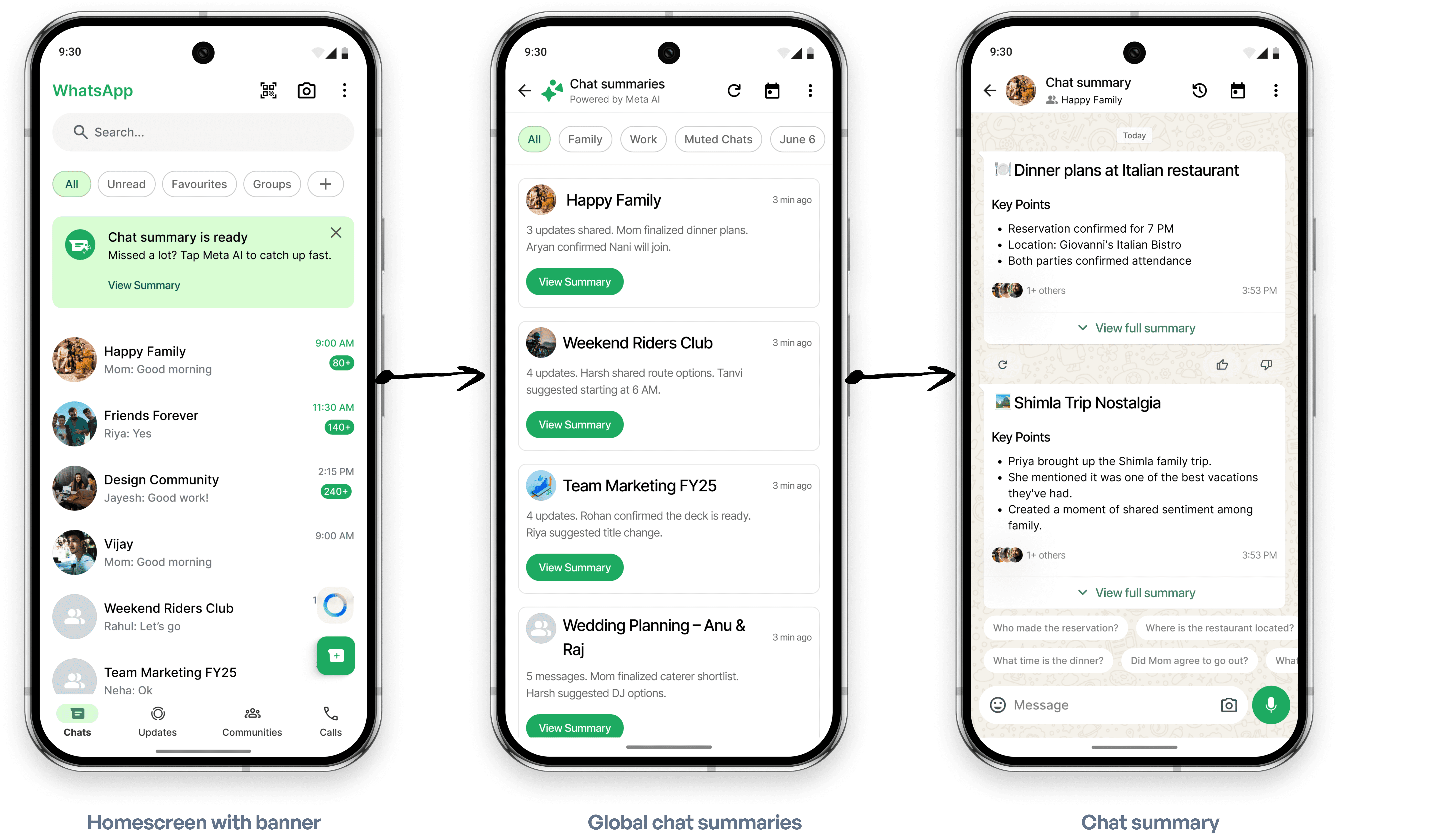
Anatomy of Global chat summary
Chat Name
Clearly shows which conversation the summary belongs to — helping users recognize the context at a glance.
View Summary Button
Tapping this takes the user into the detailed Chat Summary view for that specific chat, starting the same experience as the per-chat summary screen.
Summary Snippet
A brief AI-generated line summarizing what’s new in the chat. Shows only the most important updates to help users quickly decide which chats to check.
Filter Chips
Users can filter chat summaries by custom lists like Family or Work, as well as presets like unread messages, muted chats, and recent dates — making it easy to focus on what matters most.
3
1
2
4
04.
Chat Summary History
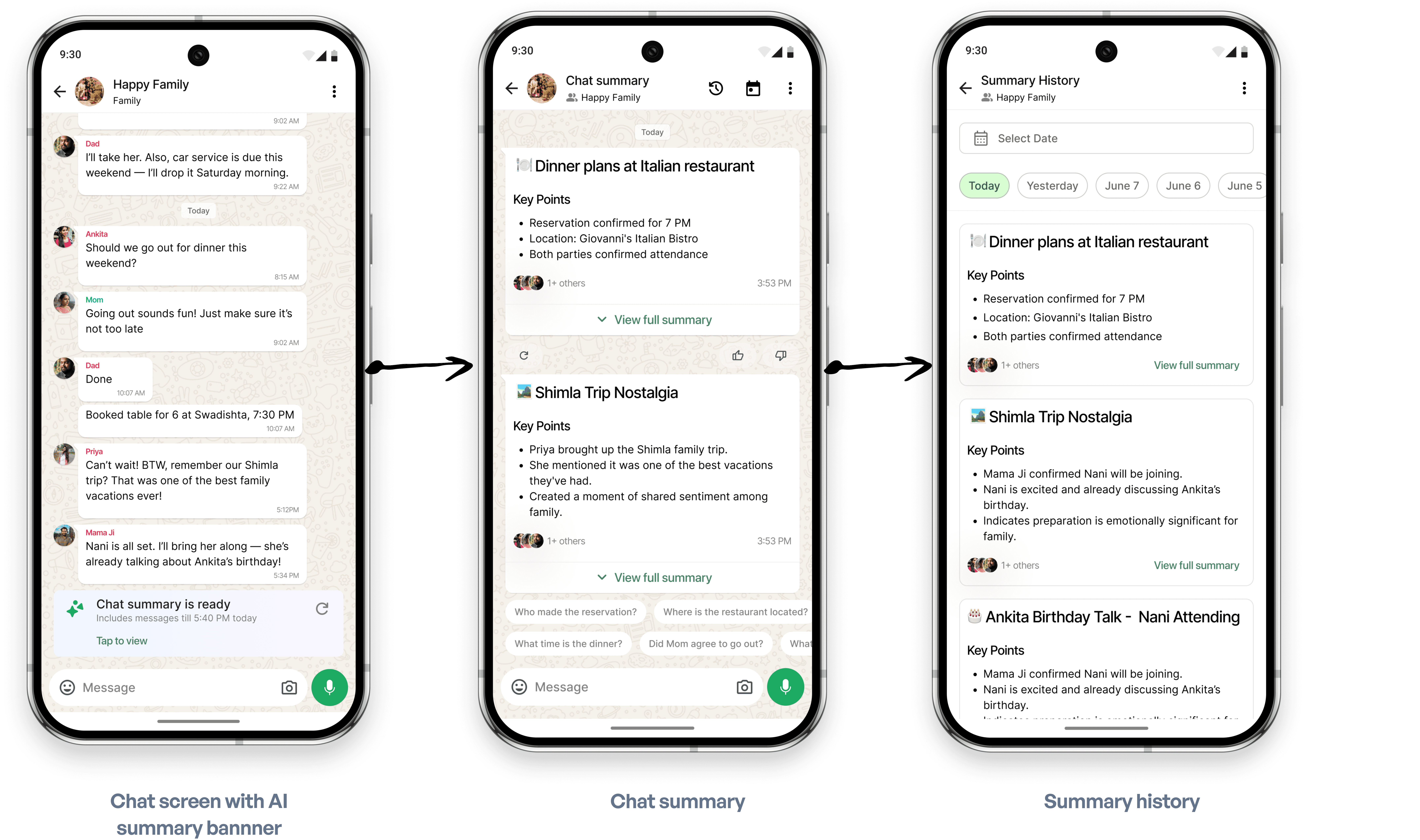
Users who revisit old updates or missed previous summaries can explore them in a time-based format by tapping the history icon on the top app bar.
Each card shows the chat name, a short summary line, and a clear “View Summary” button to dive deeper.
Filter chips at the top let users narrow summaries by chat type or date. This helps users avoid feeling lost when returning to WhatsApp after being away for a while.
userflow
04.
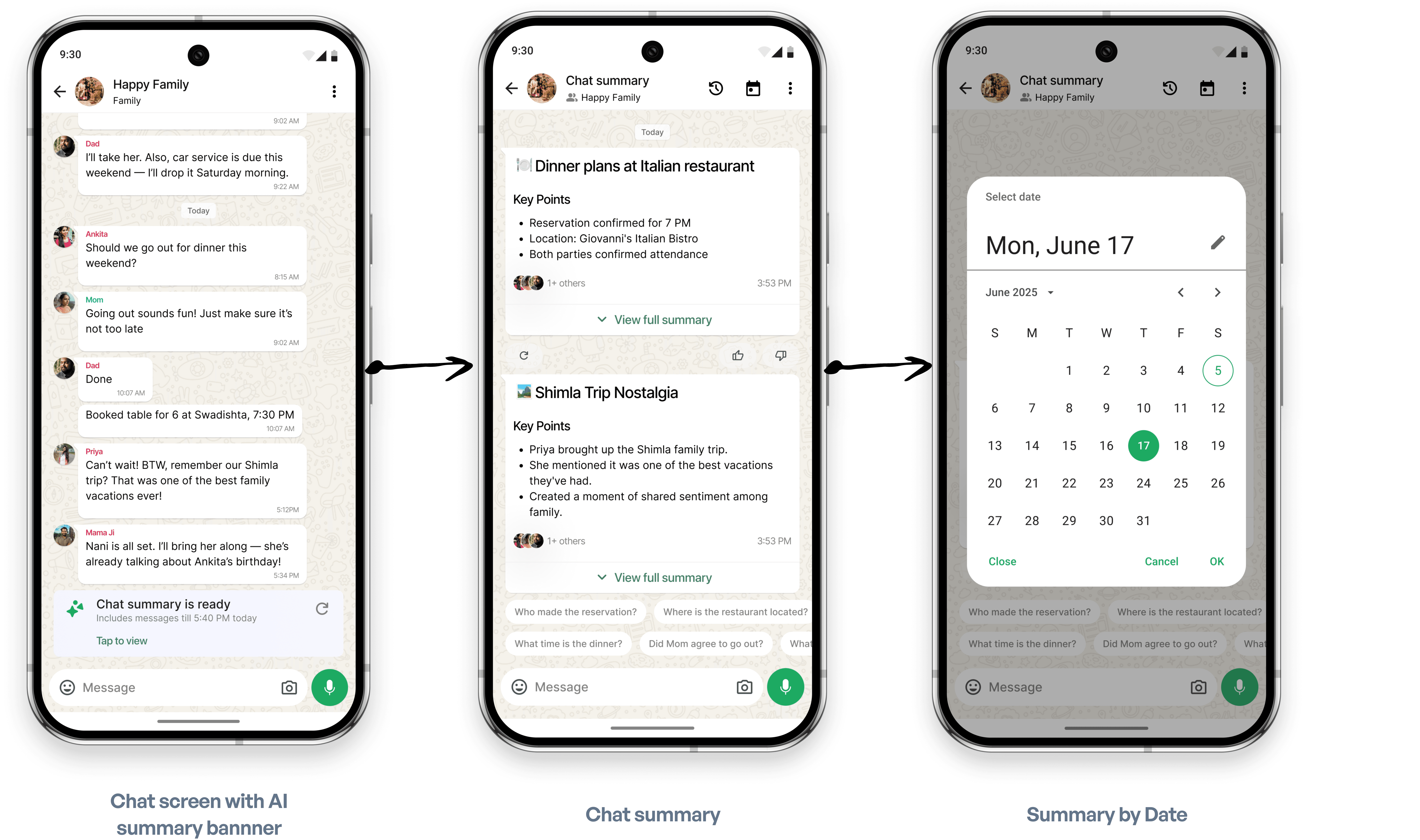
Filter Summary by Date
Users can filter the summary by date, useful when users want to reference a summary from a particular day, such as recalling event planning or meeting notes.
Press enter or click to view image in full size
userflow

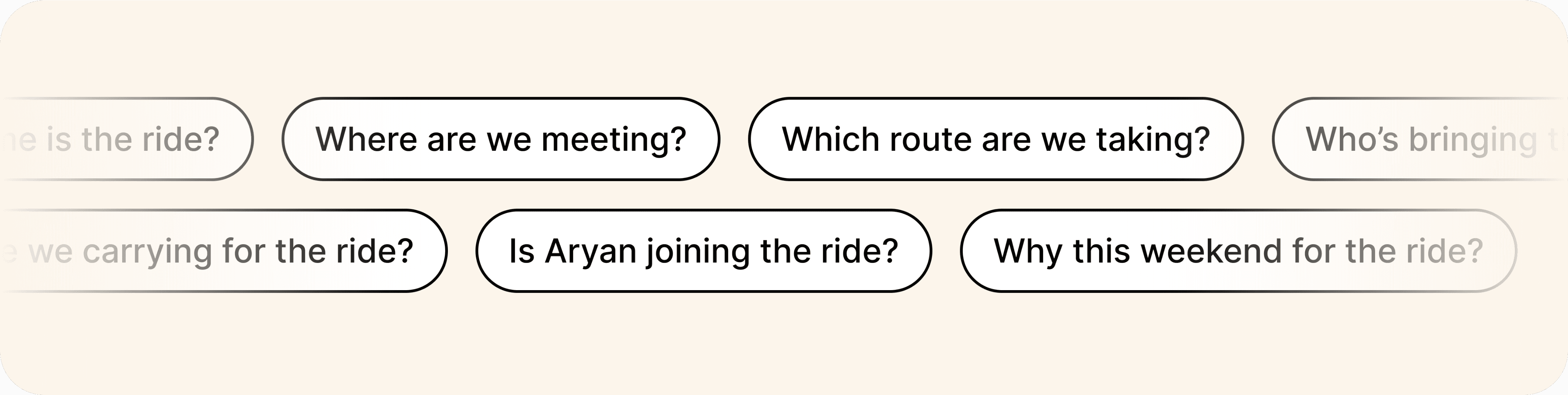
Follow-up Questions
Users can quickly ask questions based on the summary, like “What time was dinner?” or “Who confirmed the plan?” This makes catching up faster without reading full chat history and helps users get straight to what they need.
Design decision
Each flow was designed to mirror existing WhatsApp behaviors (like tapping icons or navigating via banners) to keep the learning curve minimal.

Success Metrics
To measure the impact of the AI Chat Summarization feature, I’m focusing on metrics that reflect better understanding, quicker catch-up, and deeper engagement.
Reduction in Chat Catch-up Time
Users should be able to catch up on unread messages at least 40–50% faster after using summaries compared to scrolling through the full chat.

Increase in Summary Banner Taps
A steady increase in users tapping the “Chat summary is ready” banner over time would indicate trust in the feature.
💬
Follow-up Question Engagement Rate
At least 30% of summary views should lead to a follow-up question, showing that users are using AI for clarity rather than scrolling back manually.
Learnings
Designing this AI Chat Summary feature taught me how important it is to keep things familiar and easy.
Here’s what I learned
Stay native to the platform- Users feel lost if patterns break core WhatsApp UI behaviors. Embedding summaries inside chats felt more natural than opening new layers or modals.
Minimize steps - The more screens or taps involved, the less useful summaries felt. Quick banners and inline expansion worked best.
Show value upfront - Cards with key points gave users instant understanding. It helped them feel in control without reading everything.
Let users control depth - Some users want quick skims, others want full details. Giving both “View Summary” and “View Full Summary” let people choose their level of engagement.
Reinforce AI trust with feedback - Small actions like feedback and re-summary gave users more confidence in using AI.